Wireframing is the first step in my web design process. Before I start thinking about colors or making everything look polished, I want to figure out the structure of the page: what information needs to be there, how to organize it, and how it should flow.
My process has two stages. First, I sketch by hand, quickly and very messily, to get ideas out. Then I move to the computer and build digital wireframes using gray boxes, headings, and example copy.
Those stages serve different purposes. The sketches help me think. The digital wireframes help me communicate those ideas and get feedback. And both give me opportunities to push past my first, most obvious layout.
What You'll Learn
- Define the page’s content requirements and primary action before arranging its layout.
- Sketch quickly and explore alternatives instead of committing to your first idea.
- Combine the strongest parts of several sketches when creating digital wireframes.
- Keep digital wireframes visually simple, with meaningful copy that supports structural feedback.
Table of Contents
- 1. Know What the Page Needs to Communicate
- 2. Start With Fast, Messy Sketches
- 3. Explore Different Ways to Arrange the Same Content
- 4. Mark the Best Ideas, Not Just the Best Page
- 5. Turn Your Favorite Sketches Into Digital Wireframes
- 6. Keep Exploring on the Computer
- Wireframing Is About Giving Yourself More Options
1. Know What the Page Needs to Communicate
You don’t need finished copy before you start designing a website. But you do need to know what types of information you’re trying to communicate. Otherwise, what exactly are you arranging?
For example, when wireframing a sales page for my font, I started with a simple list of content requirements:
- Images showing the font in use.
- A description and some background information.
- Purchase information for the standard and pro versions.
- Information about the bonus vectors included in one package.
- A Buy Now call to action.
The purchase action was the most important thing on the page. Having that in mind gave the exercise a purpose. I wasn’t just drawing arrangements of boxes that might look nice. I was exploring ways to present this particular information and support that action.
I keep the content list beside my sketches so I can refer back to it as I work. It doesn’t have to be beautifully written or detailed. It just needs to remind me what belongs on the page.
2. Start With Fast, Messy Sketches
I always tend to sketch before opening a new Figma file. It’s much quicker for me to draw an idea than to build it on the computer, and that speed makes a real difference to the ideas I explore.
As I draw one layout, I’ll often think of a different way to approach the next one. Sketching lets me act on that thought immediately, rather than spending ages finishing the version in front of me.
Use tools that keep you moving
I used to do this with pen and paper. Now I use an iPad Pro, Apple Pencil, and Concepts. I like its unlimited canvas because I can keep moving across the page and adding ideas without running into an edge. It’s also convenient to have my old wireframes together rather than keeping piles of paper organized.
Despite all the tools and colors available in the app, my setup is very simple: a black marker on a white background. I’m essentially recreating pen and paper digitally. You absolutely don’t need an elaborate setup for this stage.
Draw your first instinct without overthinking it
I start by drawing a box for the page. Then I look at my content list and sketch the arrangement that comes naturally to me.
For the font sales page, my first idea included:
- Navigation at the top.
- A title with a description underneath.
- Example images, potentially presented as a carousel.
- Two purchase blocks for the standard and pro versions.
- More supporting text.
- An image showing the bonuses.
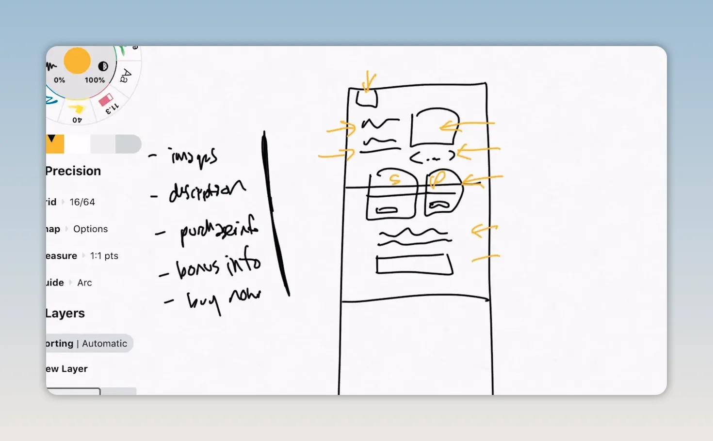
The drawing is rough, and that’s fine. The little notch at the top means navigation to me. Squiggly lines mean text. Boxes stand in for images or purchase sections.
The goal is not to make a neat drawing. It’s to capture an idea quickly enough that you can move on to another one. These early sketches are for me, so they don’t need to make complete sense to someone else without an explanation.
3. Explore Different Ways to Arrange the Same Content
Getting the first idea down is useful, but I never want to follow it blindly. Wireframing gives me a chance to get beyond familiar layouts and find more interesting ways to organize information.
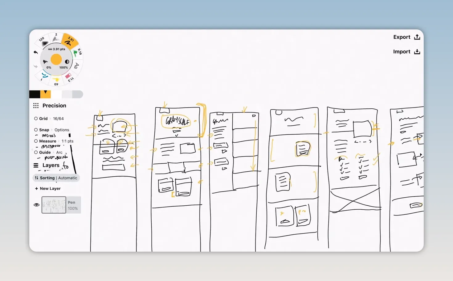
For the font page, I followed my first sketch with five more versions. The content stayed broadly the same, but I changed its arrangement, emphasis, and presentation.
Try a more impactful header
My first version had a fairly small image beside the introductory content. In another version, I explored making the headline itself a large example of the font, with a header that could take up the full height of the screen.
Below that, I tried a description beside an image, followed by three images in a row acting as a divider through the page. I also sketched a variation on the pricing blocks where the pro version extended lower than the standard version.
One thing I kept consistent was the navigation. I wanted that to remain the same across the site. Exploring alternatives doesn’t mean changing everything. You can keep the things that are already decided and experiment with the rest.
Separate imagery from information
Another version split the page into two columns. The right side was image after image as you scrolled, while the left held the information, with the standard and pro purchase options stacked underneath.
That’s a different page structure, not simply a rearranged header. It changes the relationship between the product examples and the explanatory content.
Make images the main structure
I also tried a layout built around large images. A big image formed the header, with more large images below and blocks of copy sitting on top to explain different font features.
This gave the description a different role. Instead of existing as one standalone section, pieces of it could sit directly alongside the imagery they described.
Challenge the section you keep repeating
Partway through, I noticed that I kept returning to essentially the same purchase section: a standard box and a pro box, each with a Buy Now button.
That was a useful signal. I was pushing some parts of the page, but accepting the first solution for another.
So I deliberately explored different ways to present the purchase information:
- Feature comparison columns: Instead of enclosed cards, two columns could use checkmarks to make the differences between standard and pro clear.
- A version selector: A dropdown could let people choose standard or pro without presenting a detailed comparison on this page.
Those were possibilities to explore, not final decisions. The point was to stop treating the two-card arrangement as the only option.
Rethink how the description works
In another sketch, I removed the strong division between the header and the rest of the page. I imagined a continuous background, with images paired with short explanations of the specific font features they demonstrated.
Rather than writing one big block of descriptive copy, I could break the information into smaller pieces, each with a relevant visual.
I also explored a carousel crossing a page divider, which connected with an existing idea on my homepage. That gave me another way to make the page feel related to the rest of the site.
This is where wireframing gets really useful. You’re not just asking where a section should go. You’re asking whether that information could be presented in a different form altogether.
4. Mark the Best Ideas, Not Just the Best Page
Once I’ve explored a range of layouts, I go back and put stars beside the ideas I want to take further.
I don’t need to pick one entire sketch and reproduce it exactly. My favorite direction might combine pieces from several versions.
For the font page, the ideas I wanted to explore further included the large header, the longer pro purchase block, the checkmark comparison, the carousel treatment that related to my homepage, and the short feature explanations paired with images. I also liked the possibility of placing descriptive copy over an image.
Usually, I’ll sketch for longer than a handful of versions. I keep going until I feel like I can’t think of anything else, then try to push myself to do one or two more.
That extra push matters because the first ideas tend to be the familiar ones. Keeping the exercise quick makes it easier to try something different without feeling overly invested in any individual layout.
5. Turn Your Favorite Sketches Into Digital Wireframes
Once I have some promising ideas, I move into Figma. This is where I turn my rough personal shorthand into something I can share with my team for feedback.
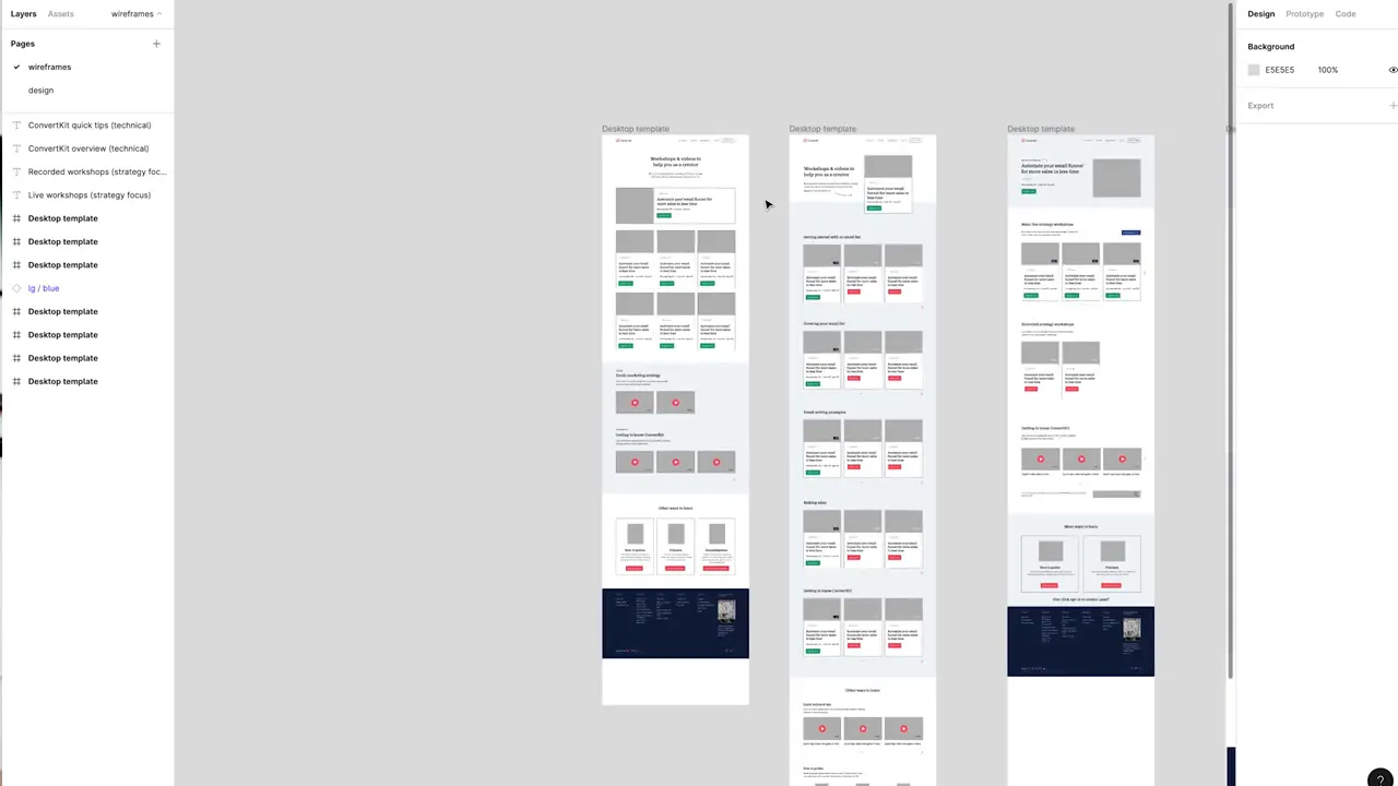
A separate project, a video training page, is a good example of this stage. I took several ideas from my sketches and built digital versions with headings, example copy, and gray image placeholders.
Keep the design deliberately unfinished
I purposefully keep these wireframes mostly gray. I don’t want them to look like completed designs, because I want feedback on the page structure rather than the exact visual styling.
Sometimes I pull components from our design system to make the work quicker. That’s why some buttons already have color, or why a footer might look more finished than the rest of the page.
But those components aren’t necessary. A plain gray box can communicate that a footer belongs there. Use enough detail to explain the layout, not so much that it distracts from the decisions you’re trying to make.
Use meaningful placeholder copy
I prefer short, contextual placeholder copy to lorem ipsum. Even if the wording isn’t final, it should give someone an idea of what the section will communicate.
That context is really important when someone is giving feedback. They need to understand what kind of information belongs in a section to judge whether its position and relationship to the rest of the page make sense.
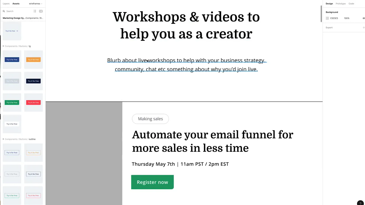
The aim is to make the content understandable without getting caught up in polishing every sentence. You’re still working out the structure.
6. Keep Exploring on the Computer
Moving into Figma doesn’t mean the creative exploration is finished. Building a more defined version of a sketch often gives me new ideas.
For the video training page, my sketches included a topic dropdown for filtering workshops. Once I started building the digital layouts, I thought about making those topics visible as small buttons or tags across the top instead of hiding them inside a dropdown.
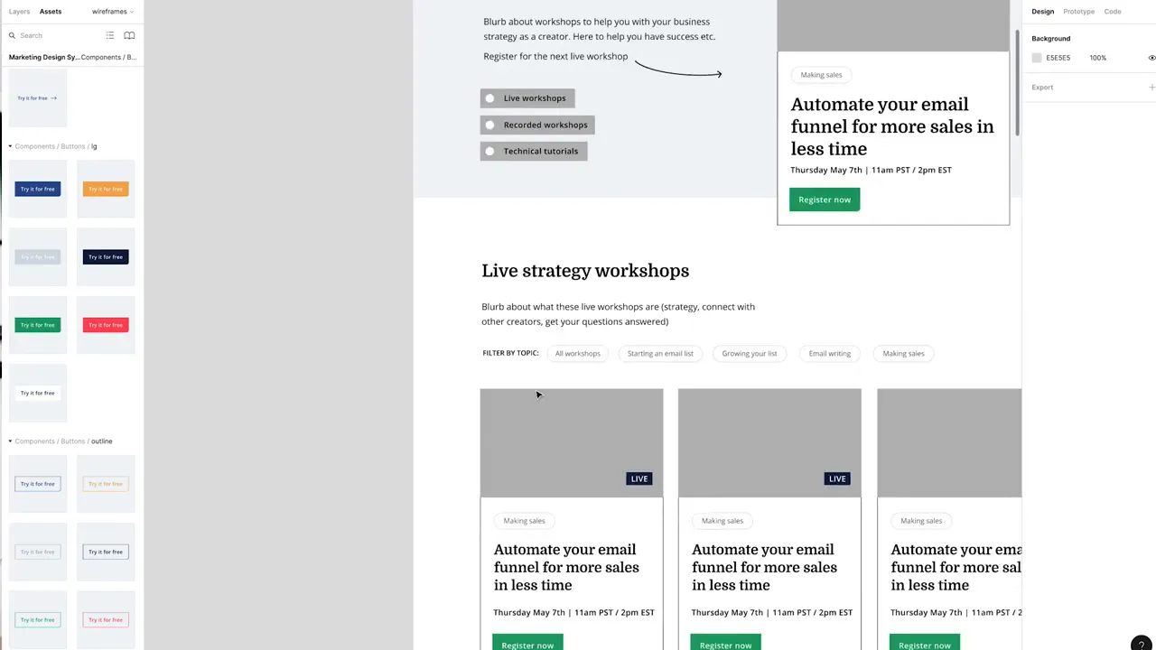
That idea developed on the computer, and that’s exactly what I want from the process. The sketches give me a strong starting point, not a set of instructions I’m no longer allowed to question.
I build out my favorite directions and keep exploring until I have a personal favorite: the arrangement I think works best for the page. On that project, my preferred version combined ideas from the original sketches with ideas that emerged while working digitally.
Wireframing Is About Giving Yourself More Options
The value of wireframing isn’t in producing an attractive set of boxes. It’s in creating space to think about how a page could work before committing to one direction.
Sketching by hand helps me generate alternatives quickly. Digital wireframes help me develop the strongest ideas, explain them clearly, and get useful feedback. Neither stage needs to look perfect to do its job.
If I went straight to the computer and built my first instinct, I don’t think some of my favorite ideas would ever appear. For me, that’s the reason to start rough, keep moving, and explore a few more possibilities before deciding what the page should become.


