I never thought building software would become part of my job as a creative director, but here we are. Recently, I’ve been a little obsessed with creating custom web apps to solve bottlenecks for our Brand Studio team at Kit.
The Kit Asset Generator is one of those apps. It’s an internal tool I built with Claude Code that lets teammates choose a template, enter their content once, and generate on-brand graphics in multiple sizes, colors, and formats. Including animated assets, which I’m particularly excited about.
I built the first version during Accelerate Week, our version of a hackathon focused on projects that move business goals forward or unblock processes. It’s definitely a V1. But it’s already helped me see how useful vibe coding can be for designers, not just for making prototypes, but for building tools around the way our teams actually work.
Key Takeaways
- Custom asset templates let teammates enter content once and generate multiple on-brand formats.
- Building design decisions into the tool reduces the brand knowledge required for self-service.
- Figma MCP connects specific template designs to the Claude Code implementation workflow.
- A reusable Claude skill helps designers add templates without making the tool dependent on one person.
Table of Contents
- The Problem: Self-Service Design Still Had Too Much Friction
- Inside the Kit Asset Generator
- How I Built It with Claude Code and Figma MCP
- A Better Result Didn’t Always Mean Adding More Controls
- Making a Claude Skill So My Team Can Add Templates
- Where My Coding Background Helped
- What’s Next for the App
- AI Can Help Build the Tool, Not Just Produce the Content
The Problem: Self-Service Design Still Had Too Much Friction
The goal was to make self-service faster and easier, with less room for questionable design decisions. Or, less politely, less room for screwing things up.
We already had two ways for non-design teammates to create assets:
- Claude Design: We have a brand design system set up there. Personally, I’ve found it more useful for landing pages, slide design, and prototyping than for generating ads and social media assets. We could probably make the templates more sophisticated, but I ran into limitations that made me want a separate tool.
- Figma Buzz: We have templates where teammates can choose a size and color, then add their content. This works, but it involves repeating the same work across variations.
Say you need a portrait graphic and a story graphic, each in two different colors. With our existing Figma Buzz setup, you’d enter the same content four times.
That’s the sort of repetitive work I wanted to remove. Enter the content once, then get all the variations you need.
Inside the Kit Asset Generator
The app starts with a small library of templates. There are hiring graphics, ads, workshop promotions, new team member announcements, and lower thirds for video. The intention is to keep expanding that library over time.
What makes this useful isn’t just that the templates look like Kit. It’s that the design decisions are built into how the tool works.
Hiring Graphics: One Input, Multiple Outputs
For a hiring graphic, I can enter a role such as “Engineering Manager” once, and that content appears across all the available sizes.
Then I can change the colorway to add variety to our social feed. That’s especially handy when we’re hiring for two roles at once and want the announcements to look different from each other.
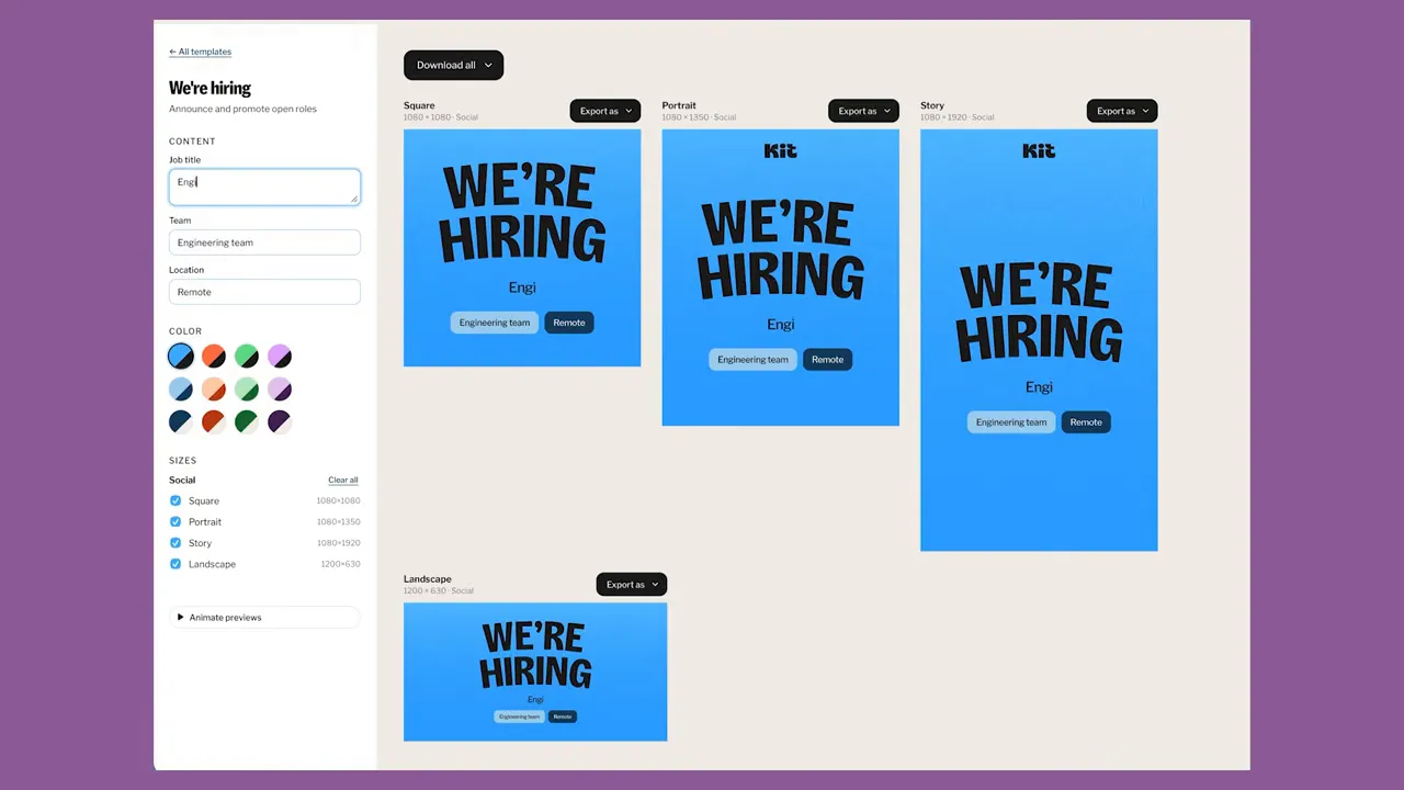
The hiring template also has animated typography to help it stand out in a feed. Graphics can be downloaded individually or all at once, with options for:
- Static PNG images
- MP4 video files
- Looping GIFs
The color pairings and the way the type animates are decisions I’ve made and coded into the template. A teammate doesn’t need to know, for example, that we wouldn’t put a green button on a blue background. The tool handles that for them.
That’s an important distinction for me: self-service shouldn’t require everyone to learn all the judgment that goes into brand design. We can make those decisions once and build them into the experience.
Ad Templates That Fit Our Workflow
I’ve set up a couple of ad templates so far. One supports case study content and creator quotes. Another combines a product image with messaging, so we can quickly create ads for different Kit features.
These include the main ad sizes we need. And because this is a custom tool, if we need another size, I can add it.
That’s one of my favorite things about building this ourselves. We’re not trying to make our workflow fit every assumption of an existing product. We can make each feature fit our brand and the work we need to do.
Workshop Promotions with Reusable Photos and Presenters
Workshop graphics are a big part of our existing self-service work, so I’ve added quite a few features to this template.
For example, if we were promoting a workshop with Pat Flynn, one of our affiliates and a Kit board member, a teammate could upload his photo or choose one from the image library. They can adjust the zoom and focal point to get the framing right.
I’ve also added the Kit team members who regularly present workshops. If Jordan, our affiliate marketing manager, is hosting instead of Shiv, our creative educator, changing the presenter is essentially one click.
There are two layout options, with different image placements, as well as the colorway choices. That means the team can generate social and ad assets for the same workshop, then test different design styles and colors.
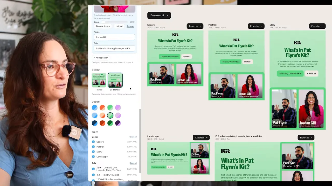
These templates are a starting point, not the limit of what the app could do. There’s plenty of room to add more creative and interesting options.
Motion Graphics for Video Editing
I don’t see the generator only as a place to produce finished social assets. It can also create elements that get edited into other content.
One example is a lower third: the name and job title graphic used to identify someone in a video. I imported a design our motion designer created in Figma, including its motion, and made the text editable in the generator.
A teammate can enter a name and title, then download a transparent MOV file to use in their video editing software.
There’s potential to expand that into title graphics, chapter graphics, and other repeatable video elements. The motion designer creates the design, and the wider team can reuse it without rebuilding the animation.
New Team Member Announcements with Background Removal
This feature made me particularly happy when we figured it out.
We have a graphic style where a person’s head extends beyond their photo frame. It’s a small thing, but it makes the asset feel more considered and premium. It’s also been one of the reasons we’ve struggled to make these announcements fully self-service.
Now, a teammate can choose a photo, and the generator removes the background, crops it, and places it into the design. Processing takes a little time, but the manual work is handled for them. They can still adjust the focal point afterward.
The “Welcome to Kit” tag is also designed to move to whichever side has more space, with an option to flip it back.
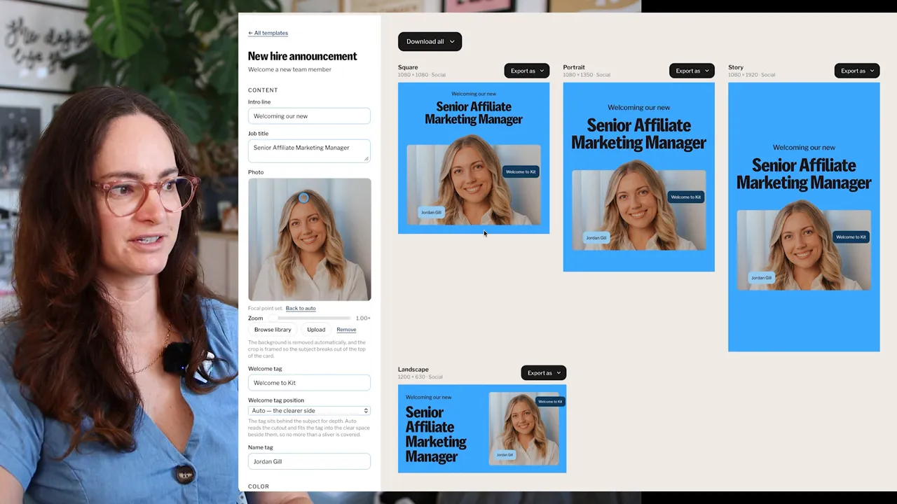
Would a designer ideally adjust the position of every label? Probably. We might overlap something a little more deliberately or move the name tag to a better spot.
But do we really need that level of customization for every announcement?
The alternative is a teammate submitting a request, waiting for it to be prioritized, waiting for us to make the graphic, and then getting the asset back. With this tool, our people and social media teams can get what they need immediately.
For this kind of repeatable work, that trade-off feels worthwhile.
How I Built It with Claude Code and Figma MCP
I honestly wasn’t sure this would be possible when I started. My first prompt was more of an experiment than a detailed technical specification.
I gave Claude Code the brand design system from Claude Design, which has an option to export to Claude Code. That provided context for the visual styling I wanted the app itself to use.
Then I described the basic idea: a React web app where someone chooses a template, adds content, and generates images.
I chose React because Corey, the developer on my team, had already put together a place for hosting internal tools with Kit Google account access, and React suited that setup.
Connecting the Actual Figma Templates
The next question was whether I could provide a Figma design and have Claude Code use it as the template.
At first, it started implementing templates based on the Claude Design material instead of the specific Figma design I wanted. It turned out I hadn’t set up the Figma MCP connection yet.
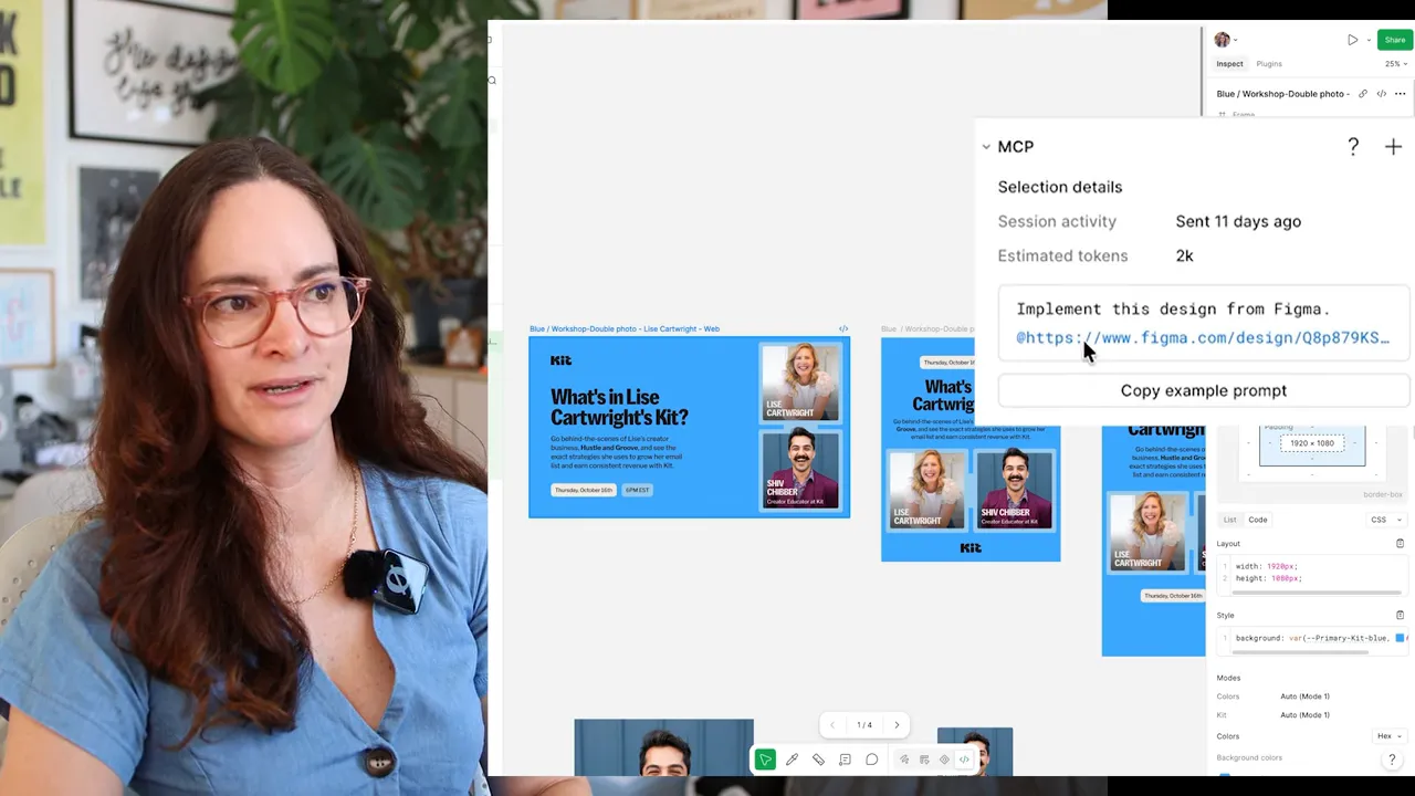
Once that was configured, the workflow became:
- Open the template design in Figma.
- Switch to Dev Mode.
- Copy the prompt from the MCP section, which includes a link to the exact frame.
- Give that to Claude Code so it can build from the intended design.
The exact frame link matters because the brand design system and the asset template serve different purposes. One provides styling context; the other is the specific design I want implemented. Figma’s MCP server documentation provides more context on the connection between Figma designs and coding tools.
Adding Animation and Downloadable Video
Once the first template was working, I asked whether we could animate some elements and download the result as an MP4.
I’d previously run into difficulty getting animation out of Claude Design and into slides, and had ended up recording my screen. That was a workaround, but not one I wanted for a tool generating multiple sizes and colorways of an ad.
For this app, the exported video needed to have the correct dimensions and be easy to download.
So I asked. And it turned out to be possible.
That became the pattern for much of the project: add a template, think about what would make it more useful, and then work out how to implement that.
A Better Result Didn’t Always Mean Adding More Controls
When I first shared the app with the team, Nathan, our CEO, immediately spotted an issue in a workshop graphic. He has a design background, and noticed a heading with a single word left on its own line.
As a designer, I’d normally fix that by inserting a line break. My first thought was to add more control to the app: perhaps people needed to edit each graphic individually, or perhaps the heading field should respect manual line breaks.
But a line break that fixes a portrait graphic might make the landscape version worse. In a wide format, the whole heading might fit perfectly on one line.
I explained my idea to Claude, then asked what other approach it would recommend. By this point, I was using Opus, having switched from Fable after it moved to paid credits.
The suggestion was to use CSS text balancing, rather than introducing manual edits. The text-wrap: balance property lets the browser balance text across lines.
Now the heading can sit neatly on two lines in a narrower graphic while remaining on one line in the landscape version.
The useful move was asking for alternatives, not just asking the AI to implement my first solution. I knew what looked wrong. I didn’t need to know the best technical fix before starting that conversation.
Making a Claude Skill So My Team Can Add Templates
I don’t want this to become a tool that only I can maintain or expand. The two brand designers on my team are the people most likely to add templates, and they have much less coding experience than I do.
So I asked Claude to create a skill for adding a template to the generator.
The idea is that a designer can create a static or motion design in Figma, provide the Dev Mode link, and use the skill to have it set up in the app. I want that process to feel approachable enough that they’re confident contributing.
There are really two self-service experiences here: one for teammates generating assets, and another for designers expanding the template library. Both matter if this is going to scale beyond me.
Where My Coding Background Helped
To be clear, I vibe-coded this. I definitely don’t think I could have built the whole thing myself without AI.
But I’m not starting from zero, either. I used to be the front-end developer for Kit’s marketing site, and I have a solid foundational understanding of HTML, CSS, and JavaScript.
That means I can open a template file and directly make a small change, such as editing help text, without prompting Claude for every adjustment. It saves tokens and AI usage.
It also means I know where I’m less confident. There are parts of the code I could probably work out, but I’m not going to edit them directly and risk breaking something.
I don’t think those coding foundations are absolutely necessary to experiment with vibe coding, but they’ve certainly been useful. So has understanding version control and how updates should move through a development workflow.
What’s Next for the App
At this stage, the asset generator is still running in my local development environment. The next step is to work with Corey to host it on Vercel behind Google authentication, so only Kit teammates can access it.
The project already uses GitHub and version control. Future updates will go through pull requests and merges.
There are still V1 details to fix, too. For example, animation stays enabled by default in a place where I don’t necessarily want it to. And, of course, there are plenty more templates I’d like to add.
What’s been unexpectedly fun is thinking like a product designer and a developer alongside being a creative director. I’m considering the experience of using the tool, not just the graphics it produces.
AI Can Help Build the Tool, Not Just Produce the Content
The bigger opportunity here is thinking beyond AI as a place for chat, research, or writing. It can also help us make custom software for specific problems in our work.
I’ve built another tool, a capacity calculator, that helps with sprint planning: can we actually do all the work we want to commit to, and what’s the best order to tackle it? It’s less visually exciting than the asset generator, but it addresses another real part of my job.
That’s what has me excited about vibe coding for designers. The starting point doesn’t have to be a big software idea. It can be a repetitive task, a frustrating handoff, or a process that keeps getting stuck.
With the asset generator, I’m still making the design decisions. I’m just building them into a tool so the team can benefit from those decisions without needing me involved every single time.


