“Can you add a bit more space here?” is valid design feedback. But it leaves the developer with a decision to make: how much more space?
Inspect Element helps you work that out before you send the feedback. You can look at how a page is built, tweak its styling in your browser, and figure out exactly what you want to change. Instead of describing something that feels off, you can share a specific CSS value or suggest an existing class.
It’s a useful way to make design reviews smoother, reduce back and forth, and speak a little more of the developer’s language. And you don’t need to know how to code a website from scratch to do it.
A basic understanding of HTML and CSS will help. If those are completely new to you, my HTML and CSS introduction is a good place to start.
What You'll Learn
- Inspect the specific element to identify which styles control the detail you want to change.
- Test CSS values locally before giving the developer precise, actionable design feedback.
- Use existing classes to recommend changes that fit your team’s design system.
- Record your preferred edits before refreshing, because browser styling experiments are temporary.
1. Open Inspect Element on the thing you want to change
You can open the browser’s developer tools from almost anywhere on a page, but I like to start with the specific element I’m reviewing. That gets me straight to the relevant part of the code rather than leaving me to hunt through everything.
In Chrome
Right-click the element and choose Inspect. The developer tools will open, usually beside or below the page. You can change where the panel is docked to suit the space you’re working in.
In Safari
You may need to enable the developer tools first. In the Safari settings shown here, that means opening Settings > Advanced and checking Show Develop menu in menu bar. The wording can vary with your Safari version.
Once enabled, right-click an element and choose Inspect Element.
I tend to use Safari because it’s my preferred browser, but the basic process is much the same in Chrome: select an element, find its styles, and experiment with changes.
2. Find out what’s actually creating the spacing
Spacing is probably the thing I most often use Inspect Element to fiddle with during a design review.
For example, on my own site there’s a small logo above a heading. Say I decide those two things need a little more room between them. Before changing anything, I need to know where that space is coming from.
With the inspection panel open, hovering over elements in the HTML highlights their corresponding areas on the page. In the Safari example, padding appears in green and margin appears in orange.
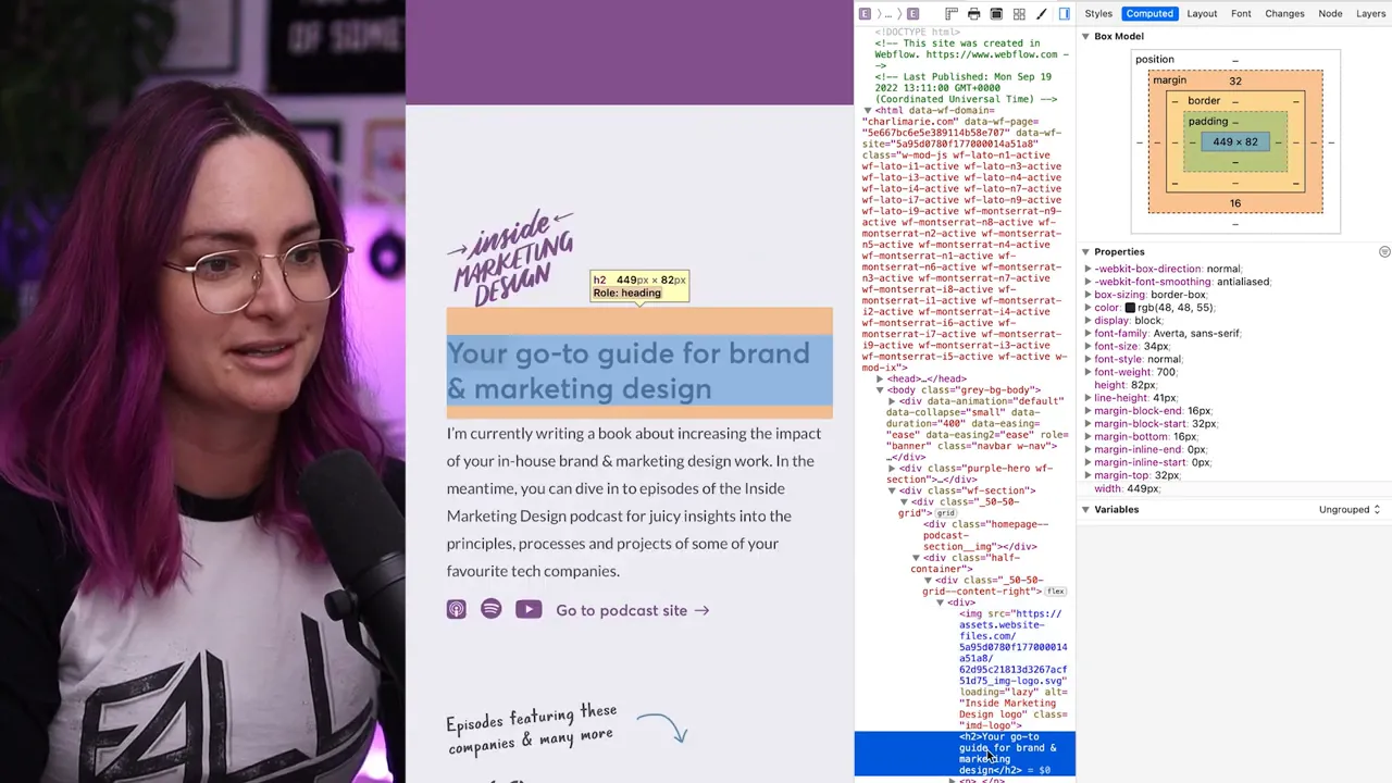
That visual distinction matters. The gap might look as though it belongs to the logo, but inspecting it shows that the margin is attached to the heading below it.
If you need a refresher, MDN’s CSS box model guide explains how content, padding, borders, and margins fit together. For this review, the important thing is to identify which element and property control the space you want to adjust.
Start by understanding the existing styling, rather than guessing where to add more space.
3. Test specific CSS values in the browser
Once you’ve selected the right element, open its Styles panel and find the property you want to change.
In the logo-and-heading example, I’m looking for margin-top on the h2. Clicking its value lets me edit it and immediately see the result on the page.
- Select the value. Click the number beside the CSS property you want to adjust.
- Try small changes. Use the up and down arrow keys to increase or decrease the value.
- Make bigger jumps when useful. In this example, holding Shift while using an arrow key changes the value in increments of 10.
- Type a value directly. You don’t have to step through every number.
- Check different widths. Look at the result at different breakpoints before deciding what to recommend.
This is where the process becomes really useful as a designer. You’re not trying to imagine whether a larger gap will feel better. You can see it in the actual page, alongside the real content and surrounding layout.
Once you’ve found the spacing you prefer, you can tell the developer which element needs changing, which property controls it, and the value you’d like to use. That’s much more actionable than “increase the space a bit.”
You’re not changing the live website
If you accidentally enter an enormous number and the layout looks ridiculous, don’t worry. These styling edits only change your local view of the page. You’re not editing the website’s source files or publishing anything that other people can see.
Refreshing the page resets these temporary changes. That gives you room to experiment without worrying that you’ll break the site. Just remember to record any changes you want to keep before refreshing.
4. Go beyond spacing: adjust images and add CSS
The more comfortable you become with HTML and CSS, the more useful, and honestly more fun, this process gets.
For example, I can inspect a background photo and adjust its background-position to explore a different crop. Trying a position of 40% or 30% lets me see how moving the image changes the composition.
I can also experiment with showing the whole photo rather than filling the area. That may reveal another issue: the background image starts repeating.
You’re not limited to editing properties that already exist in the Styles panel. You can add a declaration too. In this case, adding background-repeat: no-repeat stops the photo from tiling.
The point isn’t that every experiment will improve the design. It’s that you can test an idea in context, see its consequences, and make a more informed decision before asking someone else to implement it.
Keep track of what you changed
One reason I like using Safari for this is that its inspector highlights the declarations I’ve changed in green. That makes it easier to remember what I’ve adjusted and copy the relevant CSS into my feedback.
In the Chrome example, the edited value doesn’t have that same obvious highlight. Whatever browser you use, make sure you can identify your final changes rather than relying on memory after trying several options.
5. Use existing classes when you know the design system
Editing individual CSS values is useful, but understanding your site’s codebase gives you another option: changing the classes applied to an element.
On the ConvertKit marketing site, for example, I might decide a heading feels too large once I see it in the built page with the animation running. Inspecting it shows that it uses an extra-large text class.
Because I know how our type scale is represented in the code, I can replace that with the large text class and see whether the smaller size works better.
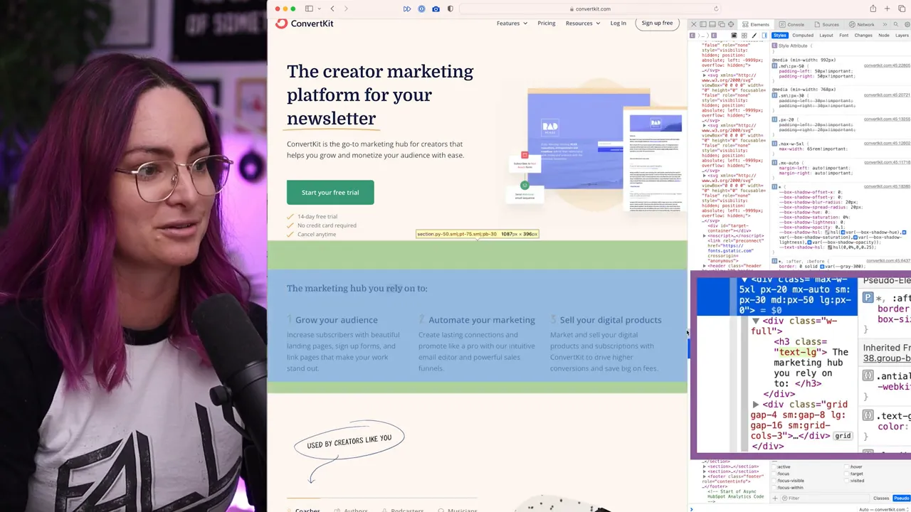
If I prefer the result, my feedback can be “use the large text class instead of extra large,” rather than a request for an arbitrary font size.
That connects the feedback to the system the developer is already working with. You’re choosing an existing option, not just handing over another isolated measurement.
This does depend on knowing the codebase. Class names and type scales vary, so it’s worth understanding how your team’s design decisions are translated into code. My walkthrough of creating a marketing site design system in Figma explores the design-system side of that work.
Make design reviews a conversation with less guesswork
Inspect Element isn’t only for finding places where the build differs from your design file. Sometimes seeing a design in the browser changes your mind about what it needs. A heading may feel too large alongside an animation, or the spacing may need adjusting once everything is in context.
That’s part of designing. Being able to test those decisions yourself helps you give clearer feedback without sending every small experiment back to the developer.
It’s also a lovely way to build your HTML and CSS literacy. Inspecting a website is a bit like taking something apart to understand how it was made. Start with one heading, one margin, or one image, and you’ll gradually become more familiar with the way your designs are built.
The goal isn’t to take over development. It’s to make your design decisions easier to communicate, so you and the developer can spend less time interpreting vague requests and more time getting the details right.


