Figma often talks to product designers and UI and UX designers. But those of us on the brand and marketing side are in there every day too, creating websites, social assets, campaign graphics, and all sorts of things the tool wasn’t originally built for.
So my question about the Config 2025 announcements isn’t just whether the new features look impressive. It’s what they could actually change for brand and marketing designers.
Between Grid, Sites, Make, Buzz, and Draw, there’s a lot to be excited about. There are also some practical questions around setup, pricing, and how smoothly these features will work outside a beautifully rehearsed demo. Buzz was the biggest surprise for me. Draw might replace some of the things I still open Illustrator for. And Sites has me seriously thinking about my neglected personal website.
These are my initial reactions to the announcements, rather than conclusions from using the products extensively. Availability and pricing details below reflect what Figma announced at the keynote.
Key Takeaways
- Grid could simplify flexible marketing layouts by reducing the need for deeply nested auto layout frames.
- Sites offers potential value for responsive design and handoff, even without using Figma to host the website.
- Buzz targets repetitive campaign production through editable brand templates, multi-edit, and spreadsheet-driven bulk creation.
- Draw brings more expressive graphic design tools into Figma, potentially reducing trips to Illustrator.
Table of Contents
- Grid: Less Nesting, More Flexible Layouts
- Figma Sites: More Than a Publish Button
- Figma Make: AI Prototyping With More Direct Control
- Figma Buzz: Finally, Something Built for Brand and Marketing Teams
- Figma Draw: More Room for Graphic Design and Craft
- The Bigger Shift: Better Systems and More Creative Freedom
Grid: Less Nesting, More Flexible Layouts
Auto layout took me a while to get my head around. It’s incredibly useful, but once you start building a two-dimensional composition, you can end up creating containers for your containers. Then someone else opens the file and has to work out why you’ve nested everything quite like that.
Grid adds a new auto layout option that makes rows and columns part of the layout itself, rather than something you have to construct from stacks of other frames.
The demo used a bento-style composition for Fluz’s brand identity. Starting with a default two-by-two grid, the presenter changed it to eight by four, adjusted the gaps and padding, and dragged assets into place. Items could span multiple rows and columns, with their initial spans determined by their size.
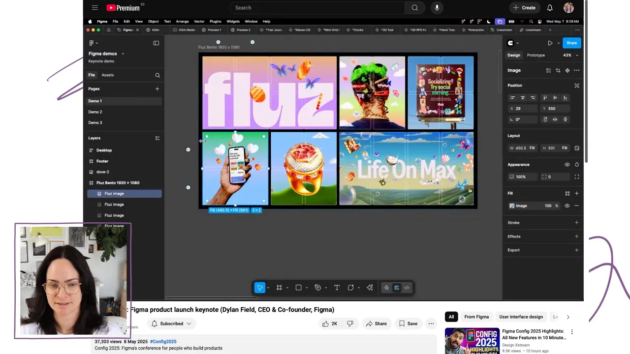
A few details stood out:
- Reordering causes reflow. Drag an item to a new position, and the items after it rearrange automatically.
- Rows and columns can be resized individually. The structure doesn’t have to be a collection of equal-sized cells.
- Grid works with other auto layout options. You can nest grids inside grids, or combine them with horizontal and vertical layouts.
- You can still break the grid. Overlapping elements and absolute positioning allow for compositions that aren’t rigid boxes.
That last point matters for brand design. A useful grid should give you structure without forcing every element to politely sit beside everything else. The examples showed typography spanning and overlapping other content, which is exactly the kind of flexibility I’d want.
Where I’d use Grid in marketing design
My first thought was resizing social media assets. If you build a composition with a deliberate grid structure, adapting its dimensions could become much easier. You could already achieve flexible layouts with auto layout, but this looks like it might require fewer layers of settings.
For web design, the connection to CSS Grid is especially helpful. If you understand how an element spans columns and rows in code, the mental model here should feel familiar. It could also work in reverse, helping designers understand the layout concepts their developers use.
The calendar example showed another practical use: repeated content arranged across a grid, with an improved AI content suggestion filling in the dates. Not the most glamorous task, but definitely one I’d rather not do manually.
I do still want to understand when Grid is the better choice over an ordinary auto layout setup. A simple two-by-two composition might not always need it. And, as always, a demo can make something look effortless before I open the tool and think, “Wait, what am I doing again?”
The benefit will depend on actually building with it. For campaign assets especially, that means having the discipline to set up a flexible structure instead of placing everything manually because it feels quicker at the time.
Figma Sites: More Than a Publish Button
I expected Figma Sites to be about taking a design and publishing it. What interested me almost immediately was that it could also improve the work that happens before publishing, particularly responsive design and developer handoff.
The demo began by copying a design from Figma Design into the Sites editor. From there, desktop, tablet, and mobile breakpoints appeared as separate frames on the canvas.
My immediate concern was whether that would mean maintaining the same design three times. Thankfully, the demo answered that.
Responsive layouts with shared edits and local adjustments
Selecting an object in the primary breakpoint engaged multi-edit across the related frames. Changing the headline updated it across the breakpoints, while a mobile-specific adjustment stayed on mobile.
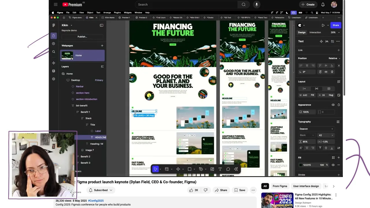
Components from an existing Figma library could also be brought into Sites, with the appropriate variant applied for each viewport.
That’s where I started thinking about our workflow at Kit. Even without moving the Kit website to Figma hosting, this could potentially help our website designer create and present responsive layouts for our developer. There may be value in Sites as a design and communication environment, not just as a website builder.
Of course, responsive demos always come with a caveat: the initial setup has to be right. I’d want to test how a real design behaves, rather than assume that adding breakpoints solves all the layout work.
Interactions that don’t require building everything from scratch
Sites uses familiar Figma interaction concepts, but also introduces preset interactions. Instead of turning a button into a component, creating variants, and setting up Smart Animate, the presenter added a hover effect and adjusted its scale and transition.
Other demonstrated effects included:
- Parallax and scroll transforms.
- Custom cursors.
- Draggable elements with momentum and boundaries.
- Marquee and typewriter effects.
The hover setup looked easier than what I remember from adding interactions to my Webflow site. That said, I don’t normally make elaborate interactive prototypes in Figma, so there would still be a learning curve for me.
One important distinction: the Sites preview was running HTML and CSS, rather than being the usual Figma prototype preview. Naturally, that made me want to inspect the code. How clean is it? How optimized are the resulting websites? Those are questions I’d need to explore before making a serious platform decision.
Publishing, templates, and the CMS preview
The publishing flow included a check for website issues and publishing to a custom domain. Figma also showed website examples, announced templates created with Play Studio, and described work on a plugin and template to help migrate Read.cv sites.
Honestly, the templates made me want to create one myself.
At the announcement, Sites was launching in beta for people with a Full seat on a paid plan, with Starter access to follow. Figma also said additional fees would apply after beta for certain hosting, custom domain, or bandwidth requirements.
An integrated CMS was previewed as upcoming functionality for dynamic content. That distinction is important: a CMS preview isn’t the same as a finished feature available in the initial release.
For my personal site, I’m interested enough to consider moving. The question is whether I’d start with a full redesign or recreate what I already have first. Either way, there’s one less excuse for leaving a portfolio website untouched.
Figma Make: AI Prototyping With More Direct Control
Figma Make takes an existing design and uses prompts to turn it into a coded, interactive prototype.
The main example was a music app called Earworm. The presenter copied a CD player frame into Make and asked it to become interactive, including having the CD spin when a track played.
What makes that more interesting than starting with a text-only prompt is that Make receives the design’s structure and metadata. It can reference the layers and use that context while generating the implementation. The demo showed Claude 3.7 generating code.
Beyond clicking through static screens
The examples covered quite a range:
- A cycling app that accepted ride data and displayed an interactive route and elevation information.
- A clinic-finding experience with a searchable map.
- Animated shaders and experimental graphics.
- A 3D tool and an explorable forest game.
- A hand-tracking experiment for manipulating shapes and colors.
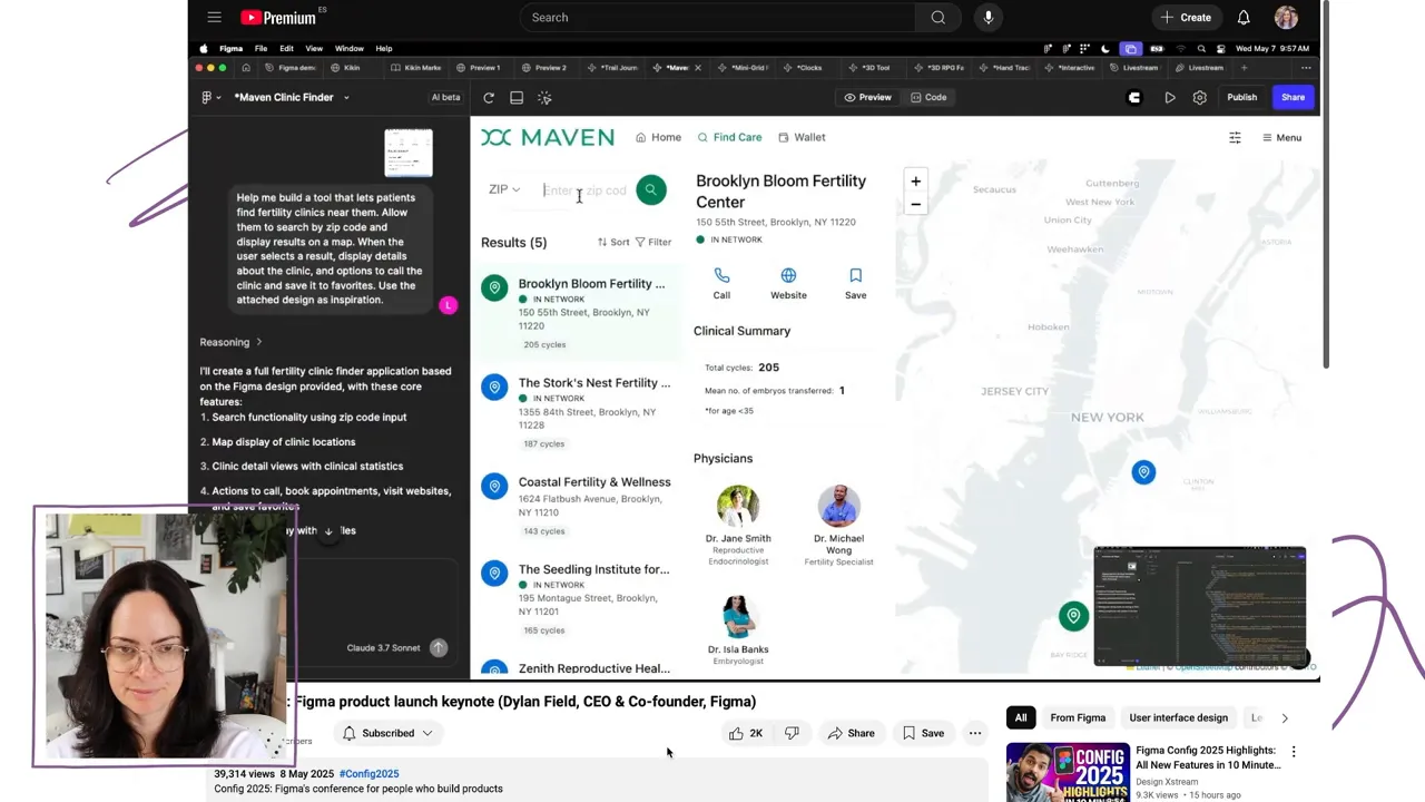
Make creations could be published, and the hand-tracking example showed how a published experience could use device hardware. Later, the music app demonstrated connections to other AI models and real data sources, including fetching audio tracks.
Figma also previewed bringing Make into Sites through a split view, connecting freeform canvas design, React code, and prompted functionality. I didn’t find that brief section completely clear, so I’d want to get into the product before making assumptions about how the whole workflow fits together.
The feature I appreciated most: Let me edit it myself
Make’s point-and-edit tool allows direct changes to things like size, color, and font. Point-and-prompt lets you target a specific part of the design for a more complex change.
That is genuinely helpful. During a Kit Create Week, I used Replit to help create an AI creator coach. One of my frustrations was wanting to make a small visual adjustment myself, rather than repeatedly describing it and getting something that wasn’t quite right.
AI is more useful as a collaborative tool when it doesn’t take away direct control. Sometimes prompting is the right way to make a change. Sometimes I just want to select the thing and fix it.
I like the name Make for the same reason. It suggests making something with AI, rather than handing over the job and blindly trusting the result.
What Make could mean for brand designers
The clearest use case for me is prototyping website interactions. It could help us move beyond describing how something should feel and create an experience we can actually evaluate.
I’m less certain about its role in everyday brand production. I’d love to explore whether it could help create motion graphics or export animations, but that wasn’t established in the announcement. For now, that’s a question, not a feature I’m counting on.
I also want to understand what AI usage will mean for pricing. An impressive prototype is one thing; knowing how a tool fits into a team’s ongoing budget is another.
Figma Buzz: Finally, Something Built for Brand and Marketing Teams
This was the announcement I didn’t expect, and probably the one that made me feel most seen.
Brand teams already produce enormous amounts of work in Figma. But getting someone who doesn’t spend their day in design files to safely update an asset can be difficult.
The keynote’s scenario was painfully relatable: an internal creative team overloaded with requests, spending time on small copy changes and production tweaks while collaborators needed their assets yesterday. When design becomes the bottleneck, people improvise, and brand consistency can suffer.
Buzz is designed specifically around that collaboration problem.
A simpler space for editing brand templates
Buzz looks familiar, but has a more streamlined interface and access to shared brand libraries. The demo used templates for a campus livestream campaign across Stories, an Instagram feed post, and LinkedIn.
Collaborators could edit directly on the canvas or use an edit-content panel. The latter is important for someone who wants to change a title or photo without feeling as though they might accidentally dismantle the design.
The templates also demonstrated:
- Built-in image styling. Dropping in a color photo applied the template’s black-and-white treatment.
- Controlled creative options. Variants allowed a background pattern to be swapped.
- Multi-edit. A photo could be replaced across the campaign’s assets together.
We’ve tried versions of this kind of structured editing before, using controls in the side panel. Having a dedicated product for it feels much more promising than trying to make a general design file behave like a friendly content tool.
Bulk creation is where it gets really useful
The campaign needed assets for 25 events across three channels. That’s 75 assets, and nobody wants to update every one individually.
Buzz’s bulk-create feature accepted a CSV file. The collaborator mapped spreadsheet fields such as title, name, and photo to the corresponding elements in the design, then generated the variations.
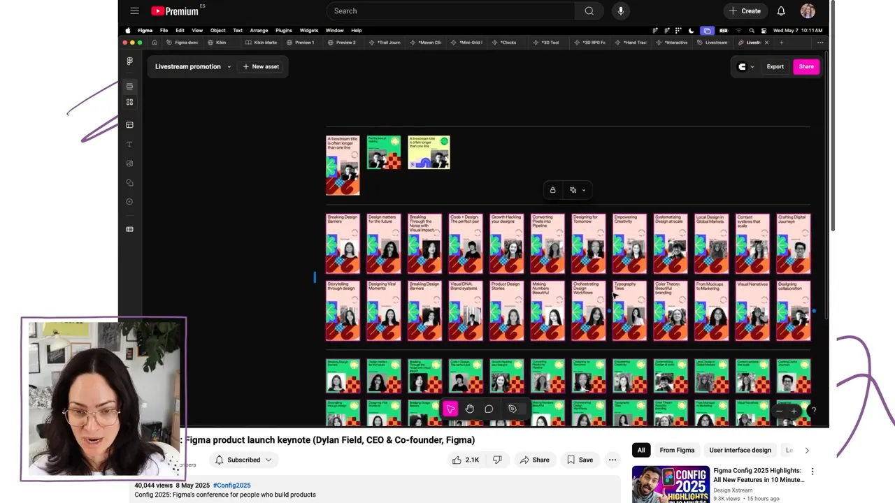
This is going to push us to be more systematic about what we design. And I think we’ll do it, because the reward is making production easier in the long run.
The setup work doesn’t disappear. Designers still need to create templates that accommodate changing content and useful variations. But that is a much better use of design time than repeatedly replacing names and photos.
The seat question
My immediate hope was that Buzz would be included in the existing Collab seat. The announcement instead introduced a new Content seat, planned for later in the year, for people contributing to Buzz, the Sites CMS, and potentially other products. It would also include FigJam and Slides.
Figma said Buzz was beginning its rollout to all users, and that after beta it would be included in Full, Dev, and Content seats.
That wasn’t exactly what I’d hoped for, but it sounded better than needing a Full seat for everyone. Managing access is already a hassle, and Full seats are expensive when all someone needs to do is update campaign content.
Am I in love with the name Buzz? Not particularly. Am I excited that Figma is building something specifically for our side of design? Absolutely.
Figma Draw: More Room for Graphic Design and Craft
Draw might change which tasks still send me back to Illustrator.
Figma announced a rewrite of core vector-editing functionality alongside 22 features and improvements. That includes work on longstanding problems with boolean operations, flattening vector objects, and outlining strokes. Fixing those foundations matters just as much as adding shiny new tools.
Draw is accessed through a mode toggle, with an interface more suited to visual design: larger layer previews, additional tools, and controls such as sliders.
Better vector editing and expressive typography
The first demonstration turned overlapping shapes into a pasta icon. Multiple shapes could be edited in vector mode at once, including selecting and adjusting their vertices together.
A new shape-builder tool let the presenter combine regions by dragging through them, or remove regions using Option. That looks powerful, although I suspect it will take some adjustment, particularly for those of us accustomed to Illustrator’s way of doing things.
Other additions included radial repeats for a scalloped border and, finally, text on a path.
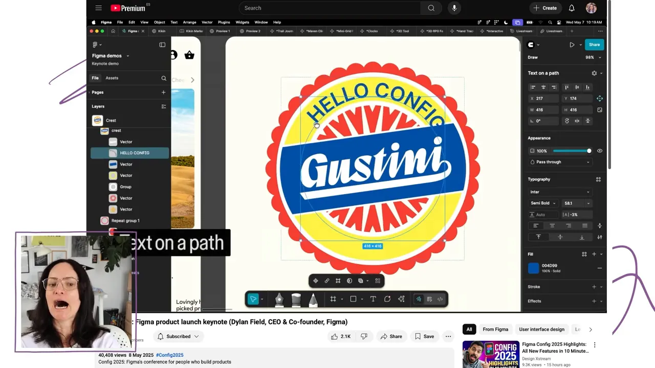
Text on a path is one of those features that might sound small until you realize how often it makes you open a different application. I’ve looked for plugin workarounds before. Having it built in is exciting.
Texture, brushes, patterns, and variable strokes
The more expressive tools were just as interesting:
- Nondestructive texture effects could roughen clean vector artwork to create a more printed appearance.
- Brush strokes and freehand brushes added less uniform edges and hand-drawn shading.
- Dynamic strokes used adjustable frequency and smoothing to create wavy lines.
- Pattern fills used a source object from the canvas, with controls for scale, spacing, and arrangements such as a hex pattern.
- Variable-width strokes allowed the weight to change at different points along a path.
The demo also showed progressive blur, a movable rotation origin, and illustrations connected to color variables so they could switch to a dark-mode treatment.
Variable-width strokes were a preview, with release expected a month or two after the keynote, including further pressure-sensitivity work. They weren’t presented as immediately available.
Pattern fills are especially appealing to me. I’ve wanted to create halftone details in Figma before and decided against it because the process was too cumbersome. A dedicated fill is much more sensible than duplicating hundreds of objects, both for editing and performance.
A lovely surprise: Kit’s illustrations
Partway through the Draw demo, I recognized the illustrations. They were originally created for Kit by the illustrator at Koto, the studio we worked with on our rebrand.
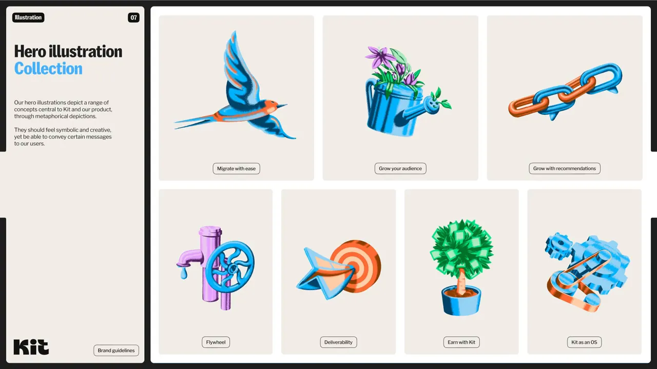
The demo explored applying brushes, dynamic strokes, patterns, and texture to that artwork. Not every treatment matched our actual illustration style, which is worth distinguishing. These were demonstrations of what the tools could do, rather than a new direction for the Kit brand.
The bird’s texture treatment did get surprisingly close to our finished aesthetic, though. Seeing familiar artwork used to explore these capabilities made the possibilities feel very concrete.
It was also a nice reminder of an extra benefit of working with a connected studio: your brand can find its way into places like this. An unexpected bit of exposure for Kit, and a lovely inclusion from Koto.
The Bigger Shift: Better Systems and More Creative Freedom
What excites me about these announcements is that they address two different needs.
Grid and Buzz could make us more systematic. They encourage flexible layouts, reusable templates, and less repetitive production work. Sites could make responsive design easier to create and communicate. Make could help us explore interactions before committing to a build.
Draw goes in another valuable direction: making more expressive work easier to create inside the tool we already use.
I do think our tools influence the aesthetics we produce. When flat shapes are easy, we use flat shapes. When gradients become accessible, gradients turn up everywhere. If texture, halftones, brushwork, and varied strokes are awkward to achieve, those details can quietly disappear from the work.
Making those options easier doesn’t automatically make the design better, but it gives us more room to make deliberate creative choices.
Personally, Sites is high on my list to explore. For the team at Kit, I can see potential in its responsive layouts and handoff possibilities. Make needs more investigation before I know how useful it will be in our day-to-day work. Buzz feels purpose-built for a problem we actually have. And Draw could replace several of my remaining reasons to open Illustrator.
More than anything, I appreciate seeing brand and marketing design recognized as work worth building for. We’ve spent a long time adapting a tool designed primarily for another discipline. It’s exciting to see Figma make more space for ours.


