Printing a T-shirt with more than one colour isn’t all that different from printing a single-colour design. The tricky bit is lining up the separate colours without smudging what you’ve already printed.
The biggest thing you can do to make the process easier happens before you pick up a screen: choose a design that doesn’t need perfect alignment. With a few smart design decisions and some careful measuring, multi-colour screen printing is very doable at home.
Prepare a Separate Screen for Each Colour
For this DIY method, you need to separate your design into its individual colours and prepare a different screen for each one. In my yellow-and-white T-shirt design, all the yellow elements belong on one screen, and all the white elements belong on another.
That’s also why professional screen printing gets more expensive as you add colours. Each extra colour means another screen, along with more time and materials to set it up.
This process starts with your screens already made and exposed, ready to print. If you’re still getting your equipment together, I’ve listed the screen printing tools I use.
Choose a Design That Gives You Room to Move
A professional screen printing rig holds the screens in precise positions. The printer can lower one screen, print a colour, lift it, rotate the rig, and lower the next screen over the same T-shirt. That setup makes it much easier to get colours sitting exactly beside each other.
With homemade screens and no alignment rig, you don’t have that same precision. So I wouldn’t recommend starting with a design where two colours have to meet perfectly along an edge. A tiny shift can make a big difference to that kind of artwork.
Instead, leave some breathing room between the different coloured elements. My “Love Life & Lyrics” design works well because the white section sits in a gap between the yellow lettering. If it’s a few millimetres off, the design still works.

Design for the equipment you have. That doesn’t mean giving up on multi-colour prints. It just means choosing a layout that leaves you a little room for error.
Measure the Whole Design Before Printing
Measuring is your best friend here. Before placing the first screen, work out the size of the complete design, with every colour included.
You’re not just finding a good spot for the first colour. You need to leave enough room for everything that will go above, below, or around it.
- Check the full design dimensions. Consider the complete artwork, not just the section on your first screen.
- Position the first screen on the T-shirt. Make sure the remaining elements will fit in their intended places.
- Establish the top alignment. I generally start with the colour that includes the topmost part of the design, so I can get that position right first.
- Print the first colour and lift the screen away. You now have a reference for placing the next screen.
Lower the Second Screen Carefully
The second colour takes a bit more care. Once you’ve printed the first colour, you can’t shuffle another screen around on top of it without risking a smudge.
I start by peering through the second screen to find the design underneath and judge where the next part should sit. Then I put one edge down and slowly lower the rest of the frame.
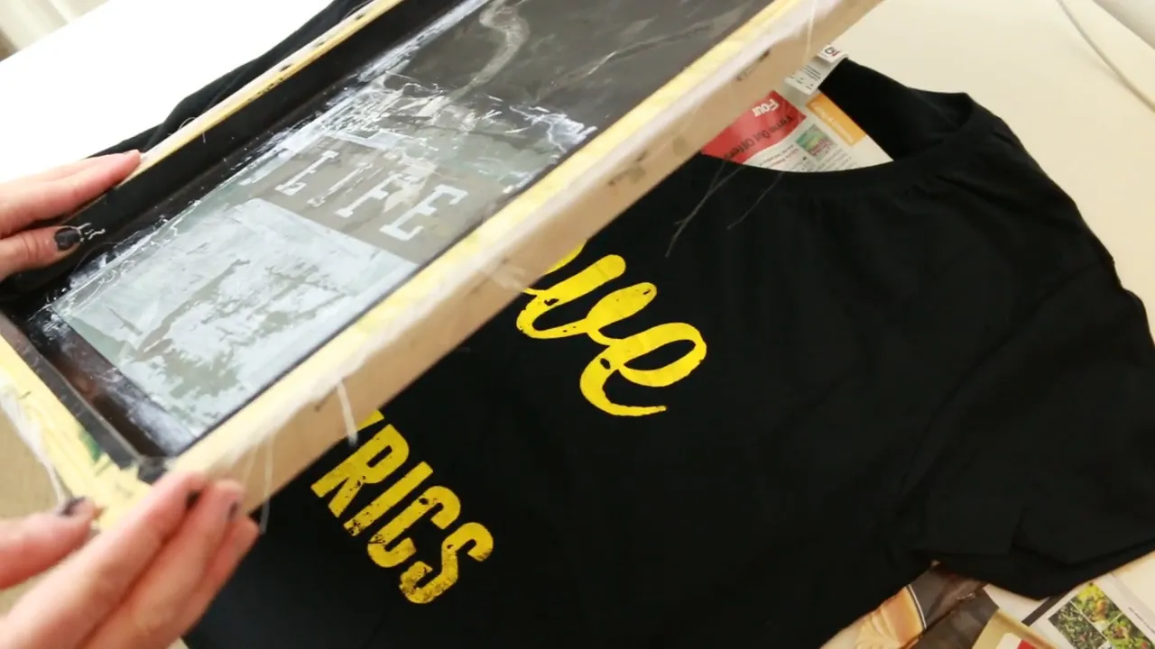
Get down low, close to the T-shirt, so you can look underneath as you lower it. Light coming through the screen can cast a shadow onto the fabric, which helps you judge roughly where the design will land.
The important things are to:
- Use the first printed colour as your placement reference.
- Lower the second screen slowly, checking its position as you go.
- Avoid sliding the screen once it’s resting on the print.
- Clamp it down carefully before printing the next colour.
Take your time with placement rather than trying to adjust the screen after it’s down. This is the main extra challenge compared with a single-colour print.
Print, Dry, and Heat Set
Once the second screen is positioned and secured, print that colour and lift the screen away. Leave the finished print to dry before heat setting.
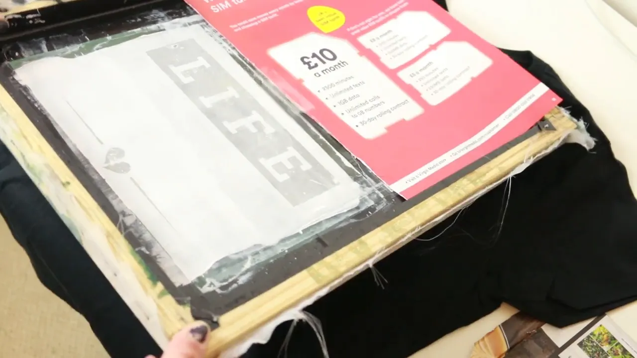
That’s really the difference between printing one colour and printing several: separate screens, a little more planning, and careful alignment between colours.
Don’t let the limitations put you off. Giving the colours some space can become part of what makes the design interesting. Constraints can be a good creative starting point, rather than something you have to fight against.
If you’d like instructions for the full process, I’ve made a PDF guide covering making the screens, exposing them, and printing with them. Fill in the form to have it emailed to you.


