There is something very cool about seeing your work on a huge screen in front of a crowd. I got to have that experience at Craft + Commerce, Kit’s annual conference for creators, where we put on our biggest product launch ever.
As creative director, I don’t do quite as much hands-on design these days. But for this keynote, I created a few motion graphics using Claude Design. They were simple, diagrammatic animations, and they ended up doing a really important job: helping people understand the problem behind our new feature and the idea behind how it solves it.
This was the first Claude Design experiment where I felt I had made something I could actually use for the task I needed it for. It wasn’t perfect. It also didn’t need to be.
Key Takeaways
- A prepared brand design system reduced repeated styling instructions when creating animations in Claude Design.
- Requesting adjustable controls let me refine animation timing without repeatedly prompting the tool.
- Consistent visual meanings helped connect separate animations into one coherent product launch story.
- AI handled production work, while concept development, art direction, and quality decisions remained my responsibility.
Why I used Claude Design for the keynote
On Kit’s Brand Studio team, we have a fantastic motion designer, Dale. He was creating the detailed product explainer for Subscriber Signals, our biggest feature launch, as well as animations for the other features we were announcing.
Those explainers were absolutely the right place for him to focus. But as we developed the keynote, we realized we also needed some simpler visuals to support the story around Subscriber Signals.
We needed to communicate two things:
- Why it gets harder to recognize individual people as your email list grows.
- How identifying high-value subscribers earlier changes the way you can nurture them.
We had been trying to communicate some of this through static visuals, but I felt strongly that the graphics needed to move. The movement wasn’t decoration. It was part of the explanation.
I already had a picture in my head of what should happen on screen at specific moments in the script. Rather than pull Dale away from the more involved animations, I decided to see whether I could bring those ideas to life myself with Claude Design.
Making an individual subscriber disappear into the crowd
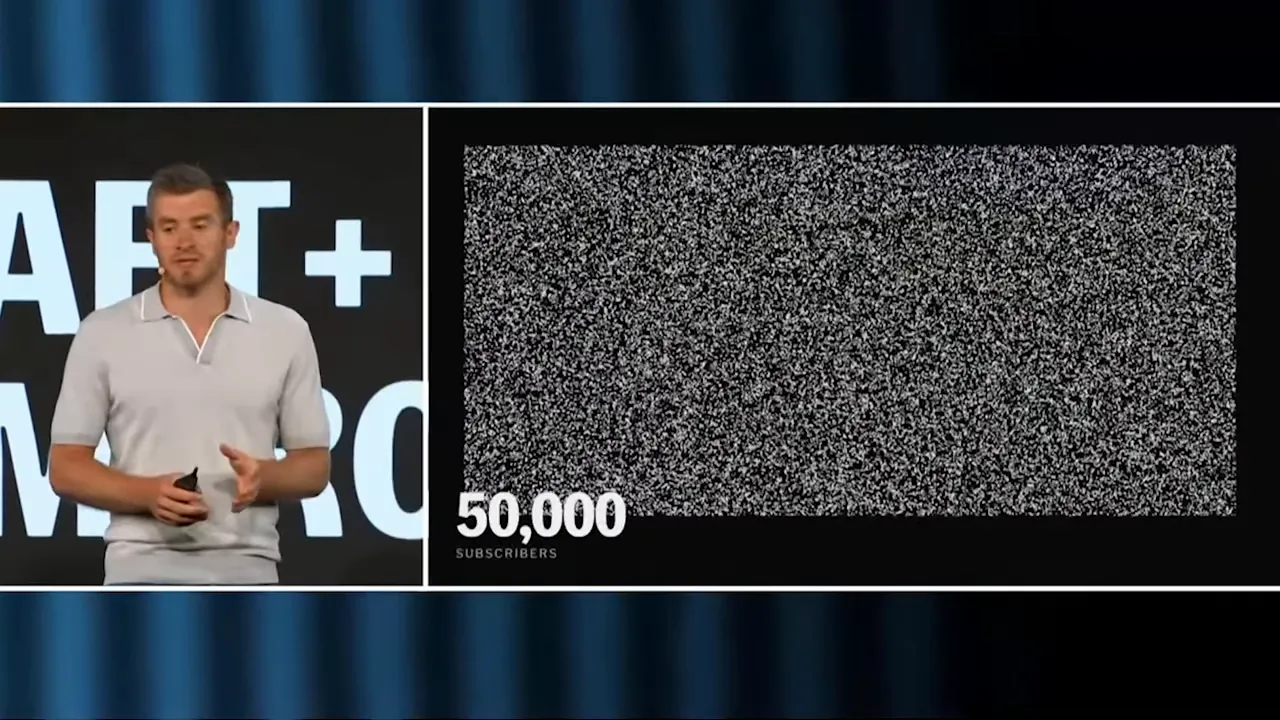
The first animation supported a moment where our CEO, Nathan, talked about remembering the first people who signed up for his email list.
With 10 subscribers, it’s easy to recognize individuals. At 100, you can still maintain some of that connection. At 10,000, it becomes much harder. At 50,000, that sense of knowing each person is nearly impossible to hold on to.
The point wasn’t that you stop caring about people. It was that you can no longer see them among all the aggregate numbers, active subscriber counts, and click-through rates.
My idea was to represent subscribers as dots on a dark background. One dot would be highlighted in blue so you could pick out a particular person. As the number of dots increased, that individual would become harder to distinguish.
What I asked Claude Design to create
I gave Claude the context and described the visual I wanted. The main ingredients of my prompt were:
- A dark background with small white dots representing subscribers.
- One dot highlighted in blue to identify a specific person.
- A progression from 10 subscribers to 100, then much larger list sizes, including 10,000 and 50,000.
- Adjustable timing for each stage so I could match the animation to the presentation.
That last point mattered a lot. I wasn’t just making an animation that looked nice on its own. It needed to support someone delivering a particular explanation, at a particular pace.
There was some back-and-forth, as there tends to be with an AI project, but the resulting visual did exactly what I needed conceptually. A handful of recognizable dots became a dense crowd.
The design system setup paid off
Before this project, I had already set up Kit’s design system in Claude Design, including our brand colors and typography.
That meant I could ask for a blue dot without specifying the exact hex value. Claude already had the right blue available. It also knew which fonts to use.
Later, with the funnel animations, it pulled in details such as soft shadows and the corner radius on the boxes. I didn’t have to describe every one of those styling decisions in each prompt.
The setup took effort, but it made creating these visuals much quicker. I could focus my instructions on the concept and behavior rather than repeatedly explaining the brand.
There was a cost to that preparation, though. Claude Design was very token hungry in my experience. I used up my weekly allowance for two weeks straight while setting up the design system. Usage seemed to have improved by the time I was making these animations, with Design included rather than treated as separate usage, but I wouldn’t pretend the initial setup was effortless.
Ask for tweaks, not just an output
One of the most useful things I did was ask Claude to create adjustable controls, or “tweaks,” alongside the animation.
These gave me settings for the underlying HTML animation that I could change without sending another prompt. For the subscriber dots, I could adjust how long each list size stayed on screen. I also had the option to hide the subscriber count.
I kept the count visible because it helped explain the scale. But having that choice, and being able to test it directly, was useful.
If you know you’ll need to tune something, ask for a control for it up front. In this case, timing was an obvious variable because the animation had to fit a spoken presentation.
Getting the animation into Figma Slides
My method for getting the finished animation into the deck was not particularly sophisticated:
- Adjust the timing using the tweaks.
- Record my screen while the animation played.
- Drop the screen recording into the presentation.
And when I say presentation, I mean Figma Slides, not Apple Keynote. I keep using “keynote” to mean the event presentation itself!
A screen recording was the method I used, rather than a dedicated animation export workflow. It got the result into the deck, and I was really happy with how it worked for this project.
Explaining traditional funnels versus signals-based marketing
Once the subscriber animation was working, I tried another part of the keynote where we were struggling to communicate the idea with static graphics.
We wanted to show the difference between a traditional marketing funnel and signals-based marketing.
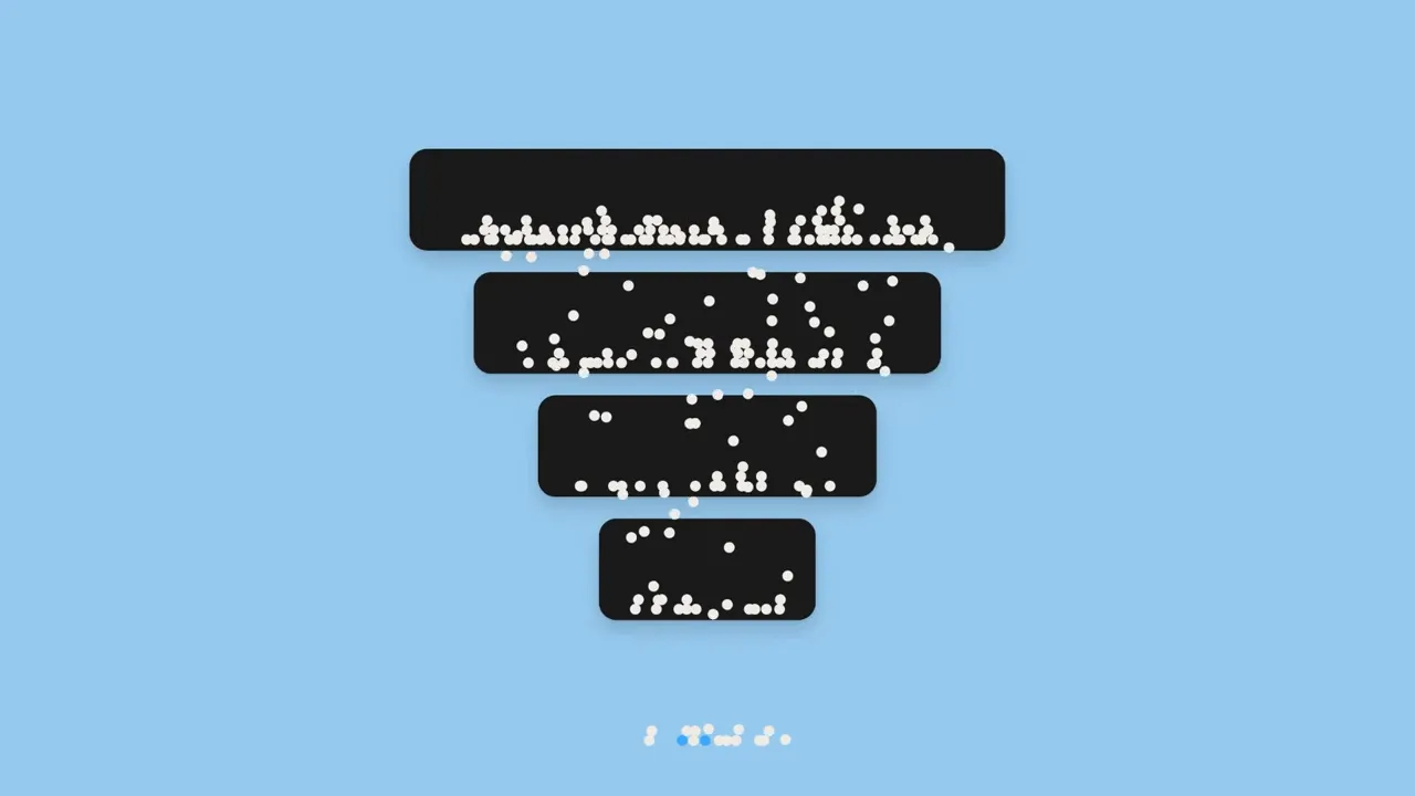
In a traditional funnel, you attract attention at the top, bring people into your marketing, and nurture them through a sales sequence. Eventually, some become buyers. You discover who the high-value buyers were at the end.
The idea we wanted to communicate with signals-based marketing was different: identify those high-value subscribers earlier, then specifically nurture them through the funnel.
That distinction is quite difficult to make clear in a single static diagram. So I built a sequence of animations.
1. Establish how a traditional funnel works
First, I asked Claude for a simple marketing funnel with no text. Dots would enter at the top, and progressively fewer would make it through each stage. At the bottom, some would turn blue to represent high-value opportunities.
I also asked for tweaks to control:
- How quickly the dots flowed through the funnel.
- How many dots made it through each stage.
One thing I had to clarify in a follow-up prompt was that some dots should remain at each level. Not everyone moves through your whole marketing funnel, and the visual needed to show people getting stuck along the way.
I initially suggested a light blue funnel on a white background, but changed the colors to maintain consistency with the subscriber animation. A white dot already meant a subscriber. I wanted to keep that meaning intact.
2. Reveal the high-value subscribers earlier
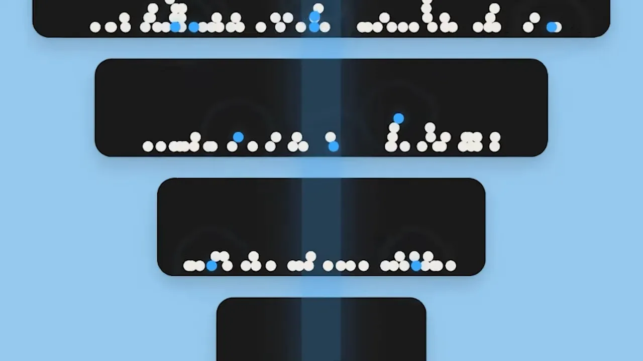
The next animation built on that established funnel. It supported the moment where Nathan asked what would happen if you could identify your high-value subscribers further up.
Now, instead of only revealing those people at the bottom, the visual picked them out earlier and guided them through the funnel.
This was the moment where I could see people in the room really get it. That was incredibly satisfying. The animation made the difference tangible: you weren’t simply waiting to discover who bought. You could recognize particular opportunities and nurture those people intentionally.
3. Show the signals-based funnel from the beginning
Finally, I made a version where the high-value subscribers were blue from the start. The animation followed those dots through to the end, illustrating the idea of identifying them early and giving them the right nurturing.
Across the sequence, the visual language stayed the same. The change was when you could recognize the blue dots and what you could do with that knowledge.
What Claude did, and what I still had to direct
Claude saved me a lot of production work. It did not make the creative decisions for me.
I was still responsible for the big-picture story of the keynote, identifying where an explanation needed support, and deciding what each animation should communicate.
I also established the visual pattern:
- White dot: a subscriber.
- Blue dot: a high-value subscriber, or the particular subscriber we were trying to identify.
We repeated that motif throughout the presentation, including in other animations. That consistency meant people didn’t have to learn a new visual language every time we introduced another idea.
The design system handled a lot of the styling, but the art direction connected those individual outputs into a coherent presentation.
That’s the distinction I care about with AI design tools: helping us bring ideas to life faster is not the same thing as doing the thinking for us.
Were the animations as good as a motion designer could make?
No. And I think it’s important to be honest about that.
With my somewhat rudimentary motion graphics skills these days, creating the subscriber animation in After Effects would have taken me a lot longer. Dale could absolutely have made it, and he could have improved it in several ways.
For example, the transition between subscriber counts wasn’t a convincing, continuous zoom out. It was partly zooming and partly fading. A motion designer could have refined that.
But did we need to spend more time improving it? For this particular use, no. It clearly showed the problem we were explaining.
The more detailed product animations needed Dale’s attention. These simpler conceptual visuals needed to communicate clearly and be ready for the presentation. Using Claude Design let us achieve both without asking one person to do everything.
That was the right priority call, not a claim that the AI output was the best animation we could possibly have made.
My honest takeaway on AI in the creative process
I have mixed feelings about AI in design. It’s a controversial topic in our industry, and one successful project doesn’t make all of those feelings disappear.
But on this project, Claude Design helped me produce visuals that were genuinely useful. They became an important part of the keynote’s story, and the feedback was lovely. A few people even texted me while the animations were appearing on the big screen, which absolutely made my day.
Claude Design is the first AI design tool I’ve felt genuinely impressed by. Not because it replaced our motion designer, and not because it invented a brilliant concept for me. It helped me execute an idea quickly enough that we could actually use it.
I’ve since used it to make animations for a feature page on our website, too. That’s the kind of use I’m interested in exploring: work that gets implemented in a real business, rather than just experiments that demonstrate what might be possible.
You can find the animations in context in the full Craft + Commerce product launch keynote.
For me, the useful role of this tool is clear: I bring the idea, the judgment, and the art direction. Claude helps me get it made. The result doesn’t have to be the most technically accomplished animation possible. It has to do the job we need it to do.


