AI design tools promise to turn rough sketches into polished interfaces, generate a brand in minutes, and build presentation slides from a text prompt. That all sounds rather useful. But does the result actually make the design process easier?
I tried four AI design tools for the first time to find out: Uizard, Visily, Looka, and Beautiful.ai. I gave them my own wireframes, a real website I’d worked on, a product name, and actual survey findings. I wanted to see where they could help with my work, where they misunderstood the assignment, and whether I should be worried about my job.
My main question wasn’t simply whether they could generate something. It was whether generating it would be more useful than making it myself.
Table of Contents
- Key Takeaways
- Uizard: Turning Hand-Drawn Wireframes Into Editable Designs
- Visily: Similar Promise, Different Mistakes
- Looka: Can AI Generate a Brand, or Just a Logo?
- Beautiful.ai: Presentation Slides That Need a Fact-Check
- So, Can AI Replace Human Designers?
Key Takeaways
- Sketch conversion produced editable starting points but repeatedly misread components, hierarchy, and layout intent.
- Logo generation offered quick options without the business understanding I wanted from a branding process.
- AI presentation output needed careful review for both data accuracy and contextual meaning.
- Automating production work still leaves designers responsible for strategy, taste, accuracy, and consistency.
Uizard: Turning Hand-Drawn Wireframes Into Editable Designs
I started with Uizard, which can take a hand-drawn wireframe and turn it into a digital design. The idea is appealing: sketch a layout on an iPad, upload it, and skip some of the work of recreating that structure in a design tool.
For the first test, I uploaded a website wireframe I’d prepared earlier and selected web as the format.
It recognized some of my scribbles, but not their meaning
The first result had a few genuinely promising details. When I draw a squiggly line in a wireframe, I generally mean a heading, and Uizard seemed to understand that. It also recognized some image placeholders and added lorem ipsum where I hadn’t written any copy.
Other parts were rather less successful:
- The little shapes I intended as icons became radio buttons.
- Some supporting text beneath those icons disappeared.
- The call-to-action button at the top was missed.
- Some elements became input fields that I hadn’t intended.
- A section of cards, which I imagined with colored backgrounds, lost its structure entirely.
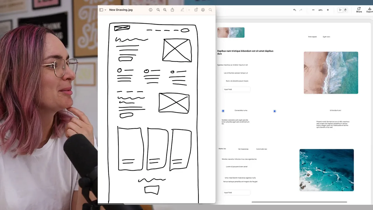
It made me wonder whether there could be a way to teach the tool my personal sketching conventions. The marks make sense to me, but clearly an icon in my wireframing language doesn’t necessarily look like an icon to the AI.
A feature I could see being useful: Going back to low fidelity
Uizard also has a feature that turns a design back into a wireframe. Interestingly, I could see a clearer use for that than for the initial sketch conversion.
When you’re working with a design system, assembling something that looks quite polished can be the quickest way to explore a layout. But that creates a feedback problem. Stakeholders can assume you’re presenting finished visual details when you’re actually still working out the structure.
Being able to strip a mock-up back to wireframe fidelity could help communicate the stage of the work. It gives people a better signal about the kind of feedback you need, without requiring you to build a separate low-fidelity version from scratch.
Rebuilding a website from a screenshot
Next, I uploaded a screenshot of the ConvertKit homepage to see how well Uizard could turn an existing page into an editable design.
The result initially appeared in wireframe mode because I’d left that setting on. Once I switched back, the page was recognizable, but there were quite a few compromises.
The font had changed. One button was editable, while another had been treated as an image. Some numbers were missing, and a hand-drawn vector speech bubble hadn’t translated particularly well.
It was a base to start from, certainly. If the goal were simply to rebuild something, it might be more useful than an empty canvas. But I struggled to find a compelling place for it in my process.
I initially wondered whether screenshot conversion could help someone learn how a webpage is structured. On reflection, I think there’s more learning in rebuilding it yourself: figuring out alignment, recreating spacing, and making the decisions needed to match what you see. Having the tool do an imperfect version of that work doesn’t necessarily teach you those things.
An AI attention heatmap, with no real data to compare
I also tried Uizard’s predicted attention heatmap. It highlighted areas it thought people would pay attention to, including larger, darker text and some faces.
It was interesting, although my impression was that contrast seemed to be doing a lot of the work. I didn’t have an actual Hotjar heatmap for comparison, so I couldn’t judge how closely the prediction matched real behavior.
That distinction matters: I could inspect what the tool highlighted, but I couldn’t validate whether it was accurate.
A second attempt with a mobile wireframe
For another test, I drew a mobile page and included actual handwriting. I also used a cross inside an image placeholder to make its purpose clearer.
And it read my writing! Considering this was my iPad handwriting, that was probably the most impressive moment of the test.
Unfortunately, recognizing the words didn’t mean it understood the hierarchy. The headline wasn’t treated as a headline, and the text sizes didn’t reflect what I intended. It didn’t produce the laptop-style image I’d sketched either, though it did seem to identify a button.
Again, I was left asking whether this was faster than dragging in the right components myself. If Uizard were already my main design tool, having that starting point inside it might be helpful. But I create my final designs in Figma, and I couldn’t see enough value here to add another step to my workflow.
Visily: Similar Promise, Different Mistakes
Visily offers similar ways to create designs from screenshots and sketches. It also specifically positioned itself as being built for non-designers, which is useful context for judging the results.
Finding the right feature took me a little while. I skipped the instructions, then immediately wondered whether perhaps I should have read them. Eventually, I found the screenshot conversion and uploaded the same ConvertKit homepage.
Two versions of the same screenshot
Visily generated two versions: one intended to closely match the uploaded screenshot, and another with a different theme.
At first glance, the top of the page looked closer than Uizard’s attempt. The font was still wrong, but it felt a little more appropriate, and some sections had been captured more successfully.
Further down, though, things started to unravel. A paragraph was missing, the speech bubble was still wrong, and some color had disappeared. It also replaced recognizable people with entirely different faces while keeping the original names underneath. That was certainly not Arnold Schwarzenegger.
One section of imagery was reproduced more successfully, but it appeared to have been kept as an image. To be fair, that section was an image on the original site too.
I couldn’t confidently call one tool better than the other. Uizard and Visily had different strengths, but both required substantial checking and correction.
When a group of cards becomes a graph
I then tried my original hand-drawn website wireframe. Visily did a better job of identifying buttons, but it interpreted another part of the layout as a chart. There was now a colorful graph where I had absolutely not asked for one.
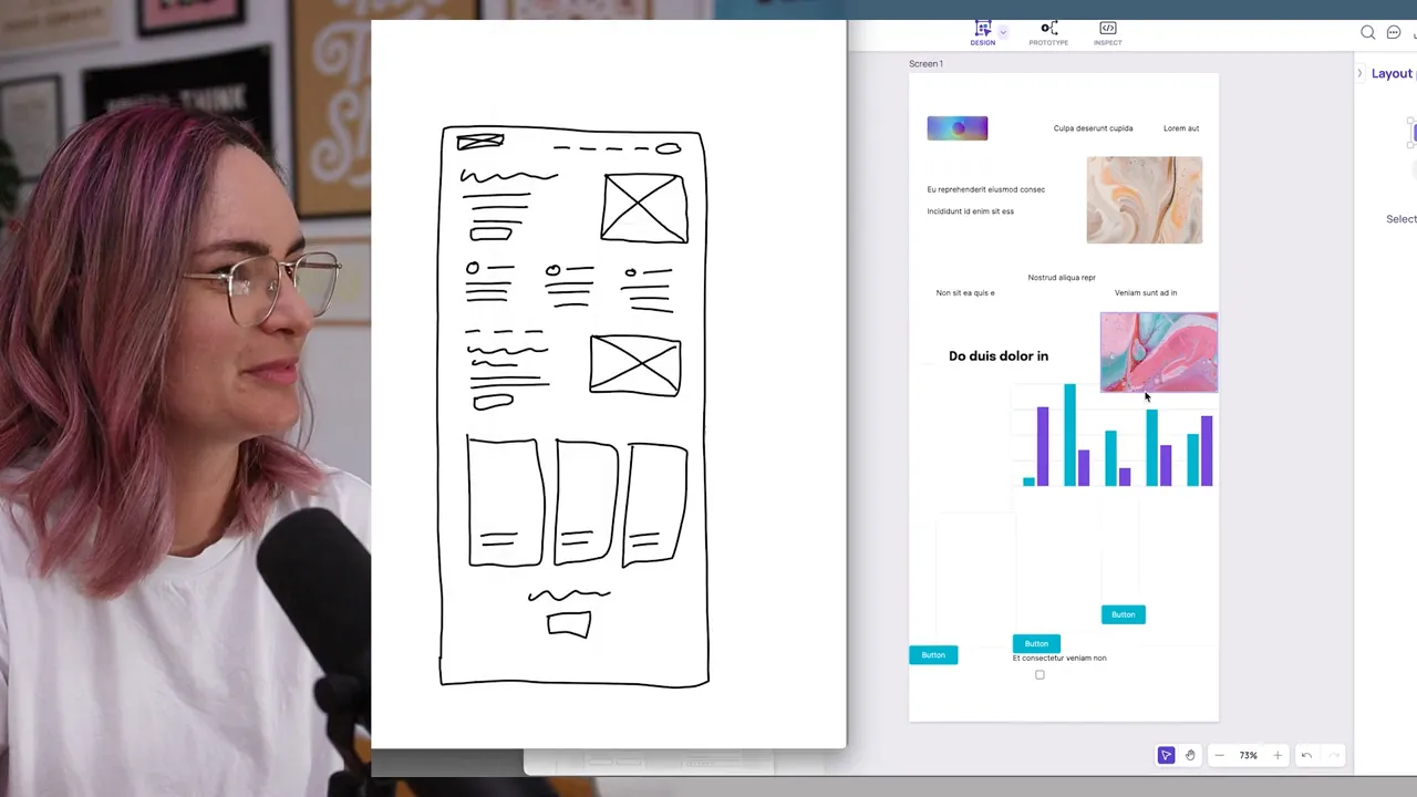
Heading recognition was inconsistent too. It understood one lower down the page but missed the main heading at the top.
With the neater mobile wireframe, it recognized the crossed rectangle as an image placeholder, which was progress. It still missed the circular shape I’d intended elsewhere, although that looked easy enough to fix manually.
Perhaps my particular style of wireframing just wasn’t a good match for either tool. The underlying idea still appeals to me. A reliable bridge between an iPad sketch and a high-fidelity design could be genuinely useful. These attempts just weren’t reliable enough for my process.
Looka: Can AI Generate a Brand, or Just a Logo?
For branding, I tried Looka with Creator Network, a new ConvertKit product that didn’t yet have a separate visual identity.
The setup asked me to choose an industry, select logos I liked, pick a color, and choose symbols. I gravitated toward simple, hand-drawn examples, selected blue, and skipped adding a slogan. For the symbols, I explored options that felt creative, artistic, and positive.
The output mostly felt like the examples I’d selected with my product name dropped into them.
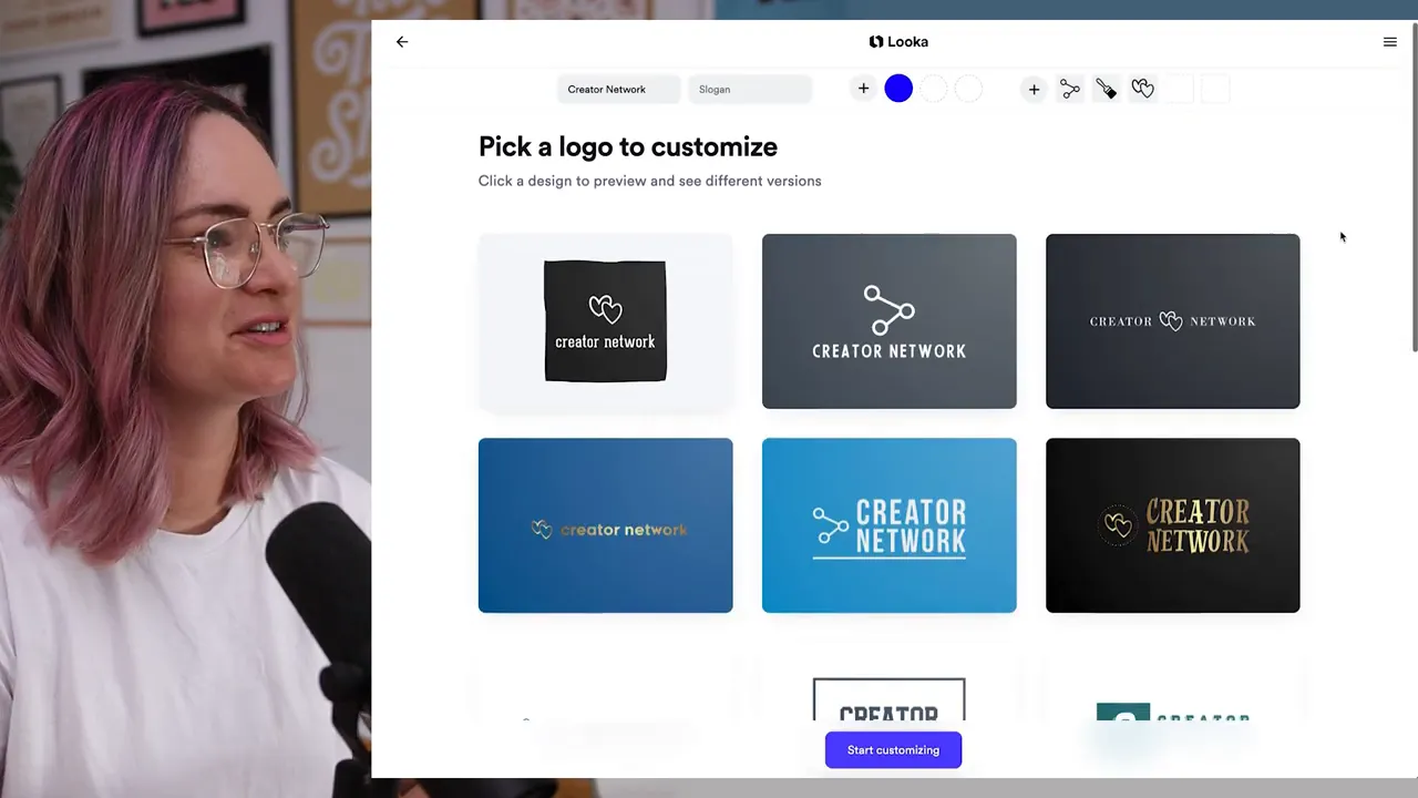
I could see an initial set of options, but continuing required signing up. I didn’t particularly want to hand over my data, so that was where I stopped.
What I wanted from an AI branding tool was something more connected to the business. Ask me what the product does. Ask who it’s for and what I’m trying to communicate. Then suggest colors or iconography that could support those goals, rather than simply asking me which ones I already like.
There’s a meaningful difference between producing a logo and developing a visual identity with a reason behind it.
Still, if you need a quick logo for a project and don’t have the skills to create one yourself, I can see how this could offer usable options. That’s a different need from the one I brought to it as a designer.
Beautiful.ai: Presentation Slides That Need a Fact-Check
Presentation design is another part of my job, so my final test was Beautiful.ai. I wanted to see what it would generate from a text prompt using findings from a real brand perception survey I’d recently run.
My first prompt was too long for the input, so I shortened it. The tool then generated a chart, interpreting my wording as a comparison between agreement and disagreement.
A plausible chart can still tell the wrong story
The problem wasn’t simply the visual design. It was the meaning of the data.
The generated slide effectively treated the share who hadn’t agreed as people who disagreed. But in the actual survey, 16.5% had selected neither agree nor disagree. Those people weren’t represented accurately by that binary split.
The chart could look reasonable while communicating something the research didn’t say. If I had presented it without checking against the original findings, it would have been inaccurate.
That’s a more consequential mistake than choosing the wrong font. A slide isn’t successful just because it looks like a convincing data visualization.
Generating content, not just formatting it
For another attempt, I tried a more conversational prompt, asking it to create content rather than simply display information I supplied. I hit the demo’s prompt limit along the way, but eventually got another result.
This time it generated a slide about ConvertKit, mentioning email, automations, and engaging an audience with personalized messages. Those details matched the business, although the result alone couldn’t tell me exactly where the tool had obtained that knowledge.
It also had the familiar AI enthusiasm I’d noticed while using ChatGPT for brainstorming. So many exclamation marks. Everything is exciting!
My favorite misunderstanding was its interpretation of “engagement.” In a slide about audience engagement, it chose a ring icon. Apparently we were getting married.
There was potentially a helpful starting point in the generated content. But both the survey chart and the ring illustrated why the output needed someone who understood the context to review it.
So, Can AI Replace Human Designers?
I don’t think AI will replace design as a career. And that isn’t because these tools made mistakes in my first tests.
They will improve. They’ll get better at interpreting sketches, recognizing components, and choosing an icon that means audience engagement rather than a wedding proposal. The limitations I encountered aren’t a reason to assume the technology will stand still.
I absolutely expect more production work to be handled by AI, and honestly, I see potential in that. If it frees designers to spend more time on creative, higher-impact work, that could be a good thing.
But operating an AI tool still requires design judgment. Someone needs to understand:
- The business and the insights that should inform the work.
- The audience and what matters to them.
- What the design needs to communicate or persuade someone to do.
- The tasks people are trying to accomplish.
- Whether the output is accurate, appropriate, and consistent with the wider body of work.
Typing a useful prompt depends on knowing what you’re trying to achieve. Evaluating the result depends on taste, context, and the ability to spot what doesn’t belong.
For my own workflow, I wouldn’t introduce any of these four tools based on these tests. At this stage, they felt more like a hindrance than a help. The starting points weren’t useful enough to outweigh the interpretation, checking, and correction they required.
But I’ll keep an eye on them, and I’ll stay open-minded about new tools. I’m interested in AI that takes some production work off my plate. I’m not convinced that producing a layout is the same thing as doing the job of a designer.


